Contact Us | 1.800.2.BERLIN
Buck Shot
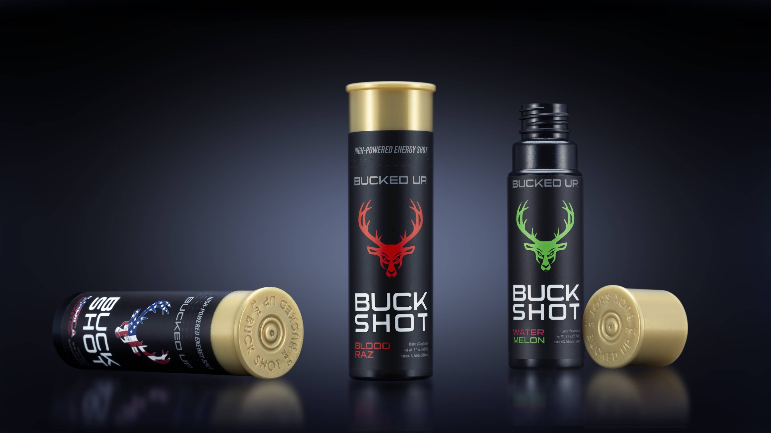
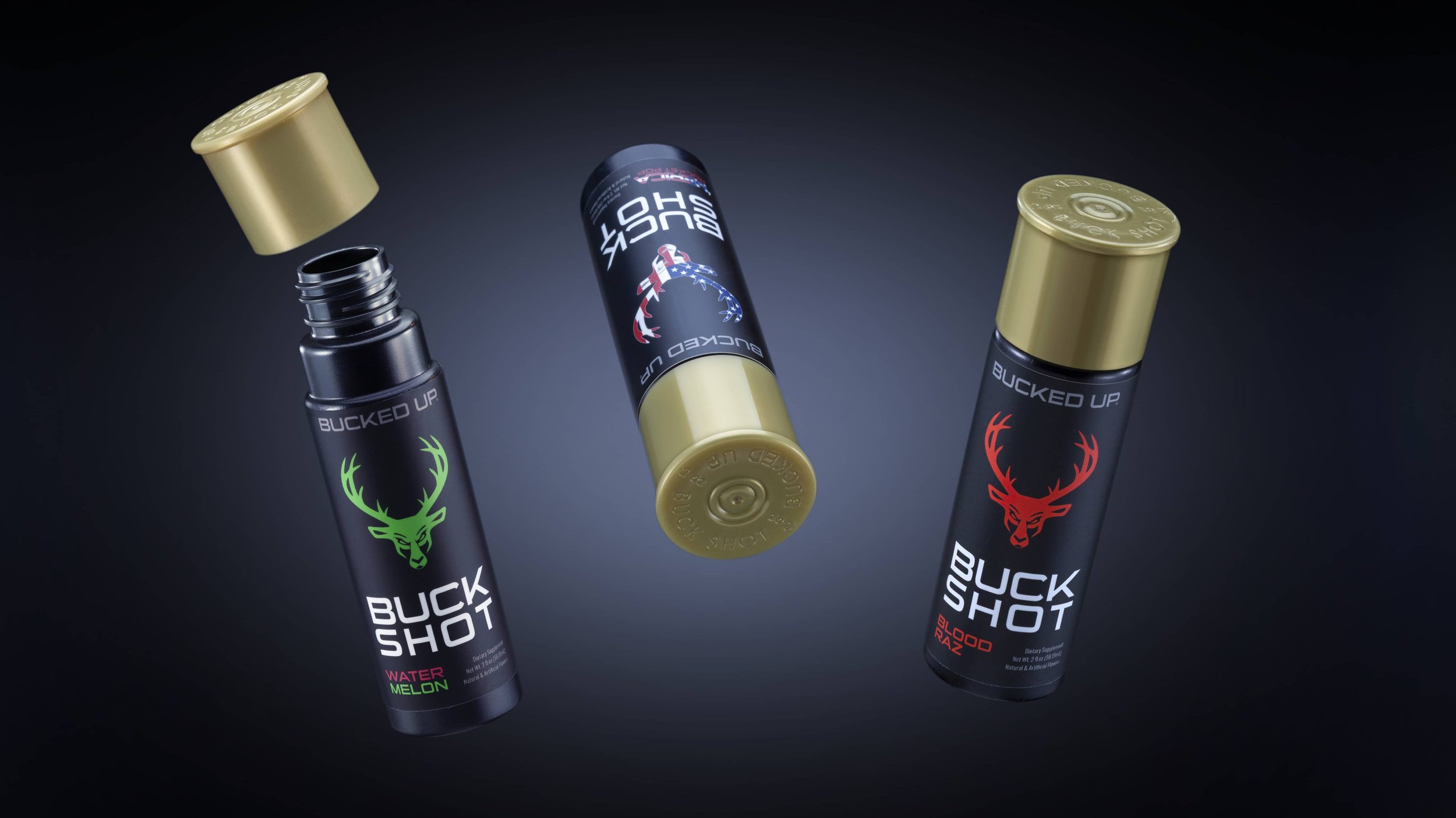
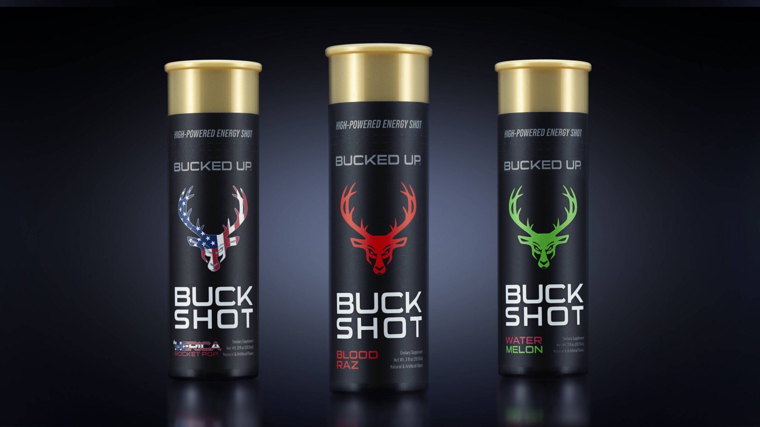
Bucking Convention
DAS Labs and their Bucked Up brand have raised the bar in pre-workout supplements with their game-changing formulas. Their secret ingredient? Deer antlers, which have been used in Eastern medicine for thousands of years. The deer, and hunting, are at the heart of the brand’s heritage and provided the perfect inspiration for their Buck Shot energy shot packaging. The Studio One Eleven team developed a bottle modeled after a shotgun shell, breaking convention with standard energy shots. The industrial designers audited shotgun shells to find the perfect proportions and closure design for the 2 oz bottle. Our engineers helped finalize the custom closure with a standard neck finish and branding details. We worked with the manufacturer to spec resins and plastic colors to ensure the shotgun shell concept was maintained from design through execution. Great design is worth a million bucks!