Pickers Vodka

← Back to our work

Pickers Vodka

Bringing the spirit of music city to Pickers Vodka packaging.

With the craft distillery market exploding, Pennington Distilling Company decided that their “Pickers” vodka brand needed a way to stand out from competitors in an increasingly crowded field. After a series of disappointing experiences with a packaging supplier claiming to have in-house design expertise, Pennington turned to Studio One Eleven to develop a truly unique packaging experience.

Pickers’ outgoing package was a stock bottle and closure that offered limited potential for real differentiation on-premise or on-shelf. In sharing their vision for a new package, Pennington challenged us to synthesize Pickers’ musical, cultural and regional themes into a new brand experience celebrating the distillery's Nashville roots. Importantly, Pennington also asked that our new package have minimal impact on existing filling, decorating, capping and pack-out operations.

After performing a category audit of Pickers’ competitive set and in-market field research on Nashville’s heritage, music, and bar culture* we crafted a bottle that establishes clear connections to Pickers’ roots. Bartenders and shoppers alike first notice that the sides of the bottle are embossed with a guitar fretboard spanning from bottom to top. Near the neck of the bottle, a guitar pick-shaped embossment captures the iconic three stars of the Tennessee flag’s Grand Divisions. Both fretboard and the pick elements represented significant technical challenges, but we worked closely with Berlin Packaging’s Supply Chain and Custom Tooling divisions to insure that our vision was faithfully executed in glass. From initial concept sketches to refinement and engineering, Pennington's and Berlin’s product development teams remained fully aligned via our use of the latest 3D visualization and rapid prototyping tools.

The results speak for themselves: An impactful packaging experience that will propel the Pickers brand to even greater successes quickly brought to market via our turnkey suite of design, engineering, sourcing and logistics. Cheers to that!

*Yes… We’re fully committed to immersing ourselves in our work.

Di Amore

← Back to our work

Di Amore

The Look of Love

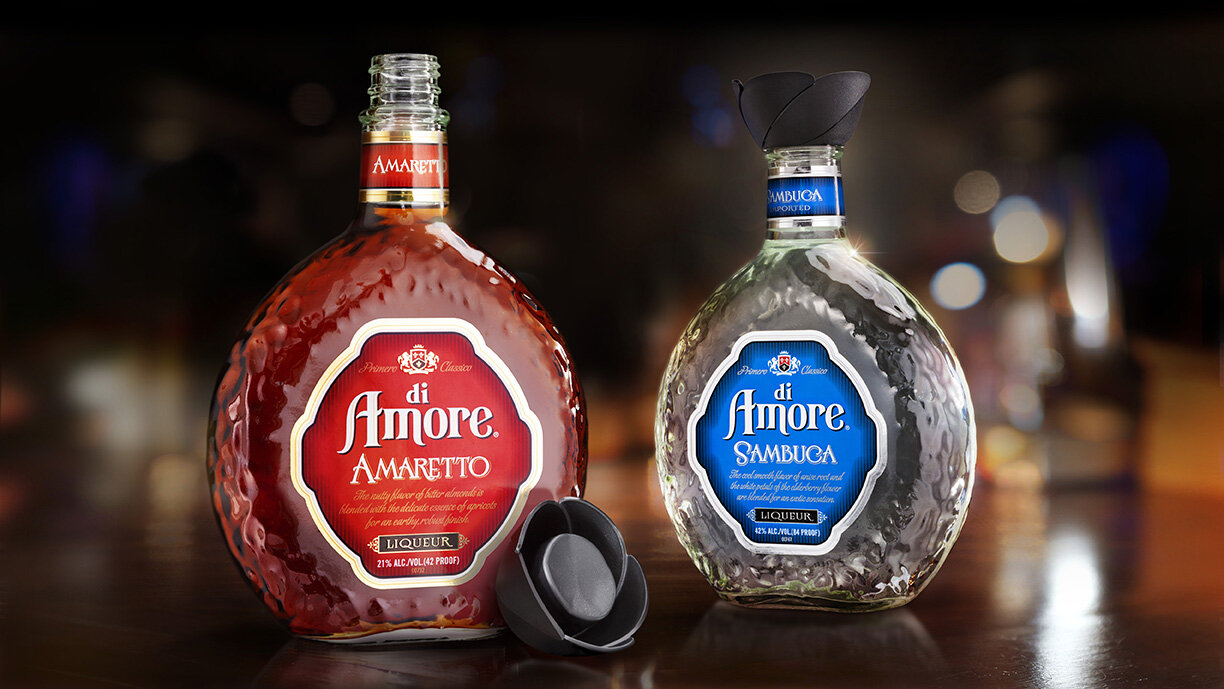
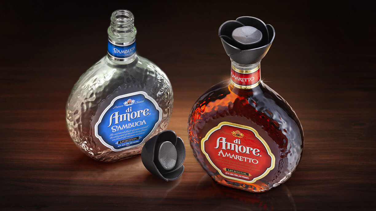
When Sazerac needed a new overcap design for their Di Amore liqueur bottles, they partnered with Studio One Eleven on a custom design that captures the romantic spirit of the brand. For our structural design team, it was a labor of love…literally. Inspired by the Di Amore name itself, our designers wanted to create a unique and ownable design that represents love. The new overcap utilizes a simple, classic flower blossom as a universal symbol of romance and affection. Each petal was uniquely designed with a combination of matte, gloss and texture to add dimension and capture the light. Our team ensured the new design works with the existing bottle and closure for streamlined manufacturing and cost-efficiency. The final design has the look of love.

Sungleam

← Back to our work

Sungleam

Design on the Bright Side

When American Vintners wanted to create a new low-calorie wine brand with an upbeat vibe, they worked with their partners at Studio One Eleven. The Studio’s brand strategists developed a range of brand names that evoke happiness and positivity. Sungleam suggests sunny optimism and provided the perfect inspiration for the label graphics. The designers played with opacity and transparency to create a lively geometric pattern that dances across the bottle like sunbeams. Subtle linework from the background pattern is repeated in the simple brandmark. Each varietal has its own color palette that reflects the wine’s flavor profile, and a radiant yellow band ties the portfolio together. This is one brand that always sees the (wine) glass as half full!

American Vintners Valentine Gift Box

← Back to our work

American Vintners Valentine Gift Box

Love at First Sight

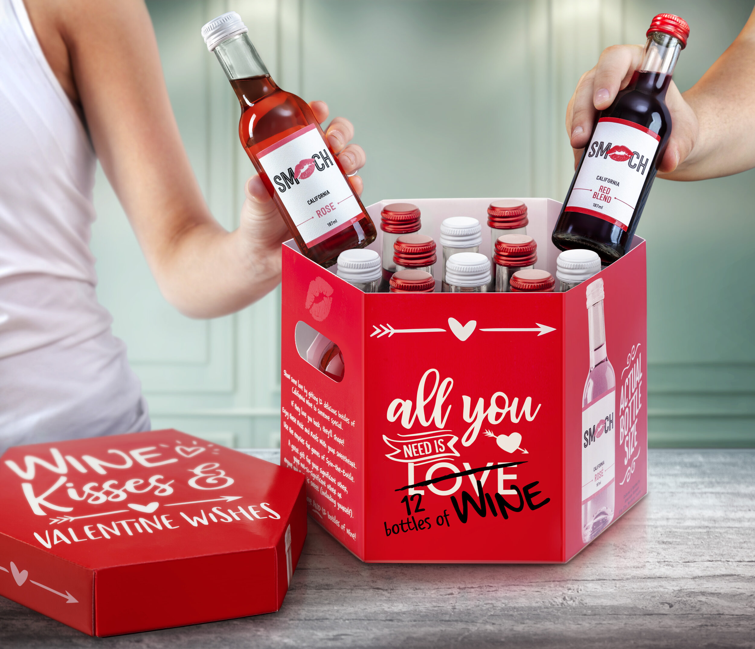
American Vintners’ one-of-a-kind seasonal collections help people celebrate anytime, anywhere with a great bottle – or bottles – of wine. To create the packaging for their Valentine’s Day collection, American Vintners returned to Studio One Eleven, who also designed the company’s Wine Advent Calendar and 12 Days of Christmas collections. For this latest packaging, the Studio’s team of brand strategists and graphic designers started by ideating a range of love-able design themes for the collection. The selected “Wine, Kisses & Valentine Wishes” concept uses simple, bold typography and an impactful, romantic color palette of bright red, white and black that stands out in traditional retail as well as warehouse club stores. In addition to writing copy and designing graphics for the outer carton, the team at Studio One Eleven also named and designed the “Smooch” wine bottles found inside, complementing the case design with label graphics that are sealed with a kiss. The final design had consumers in love at first sight!

Veza Sur Brewing Company

← Back to our work

Veza Sur Brewing Company

Staying true to the brew.

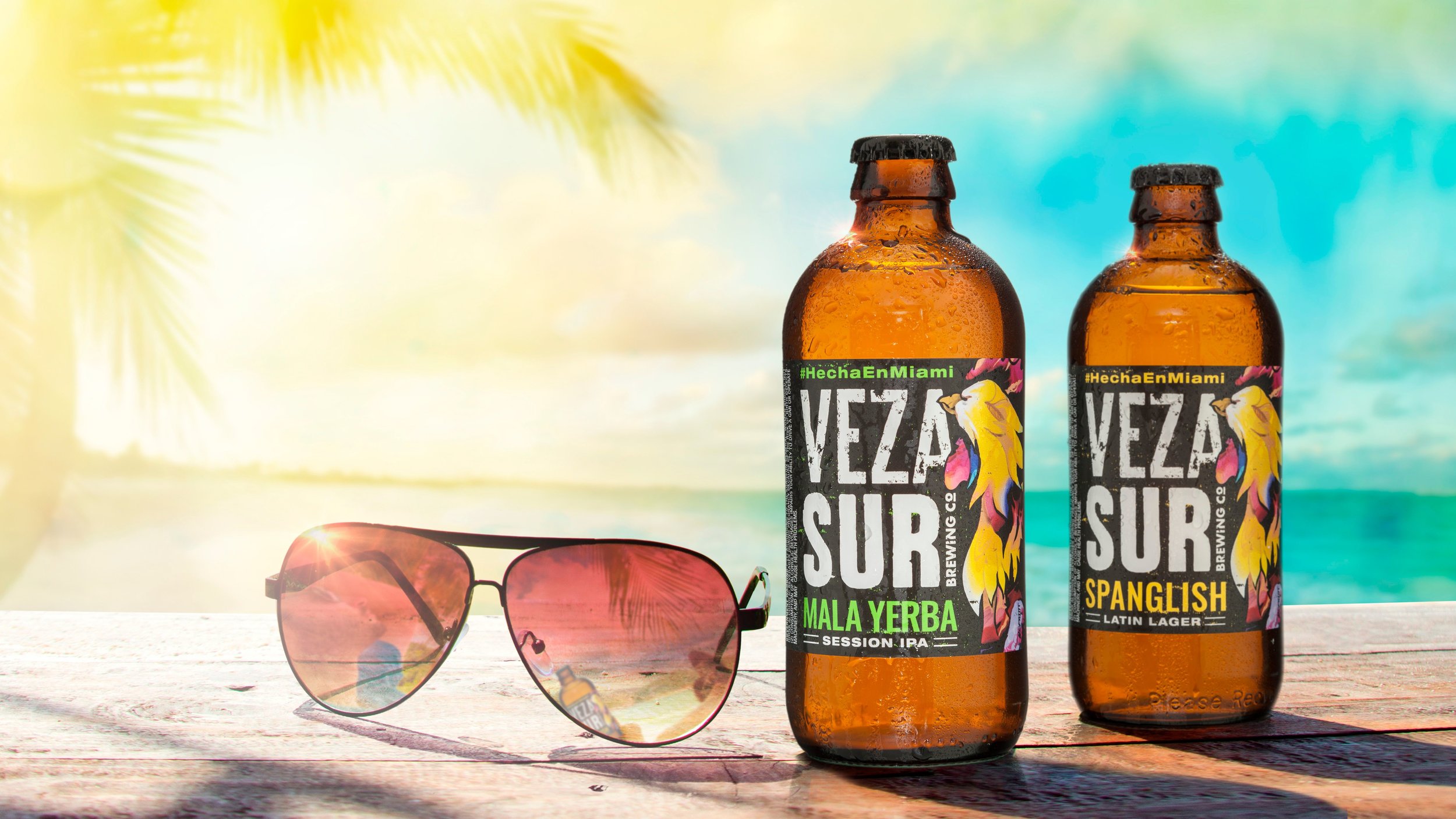
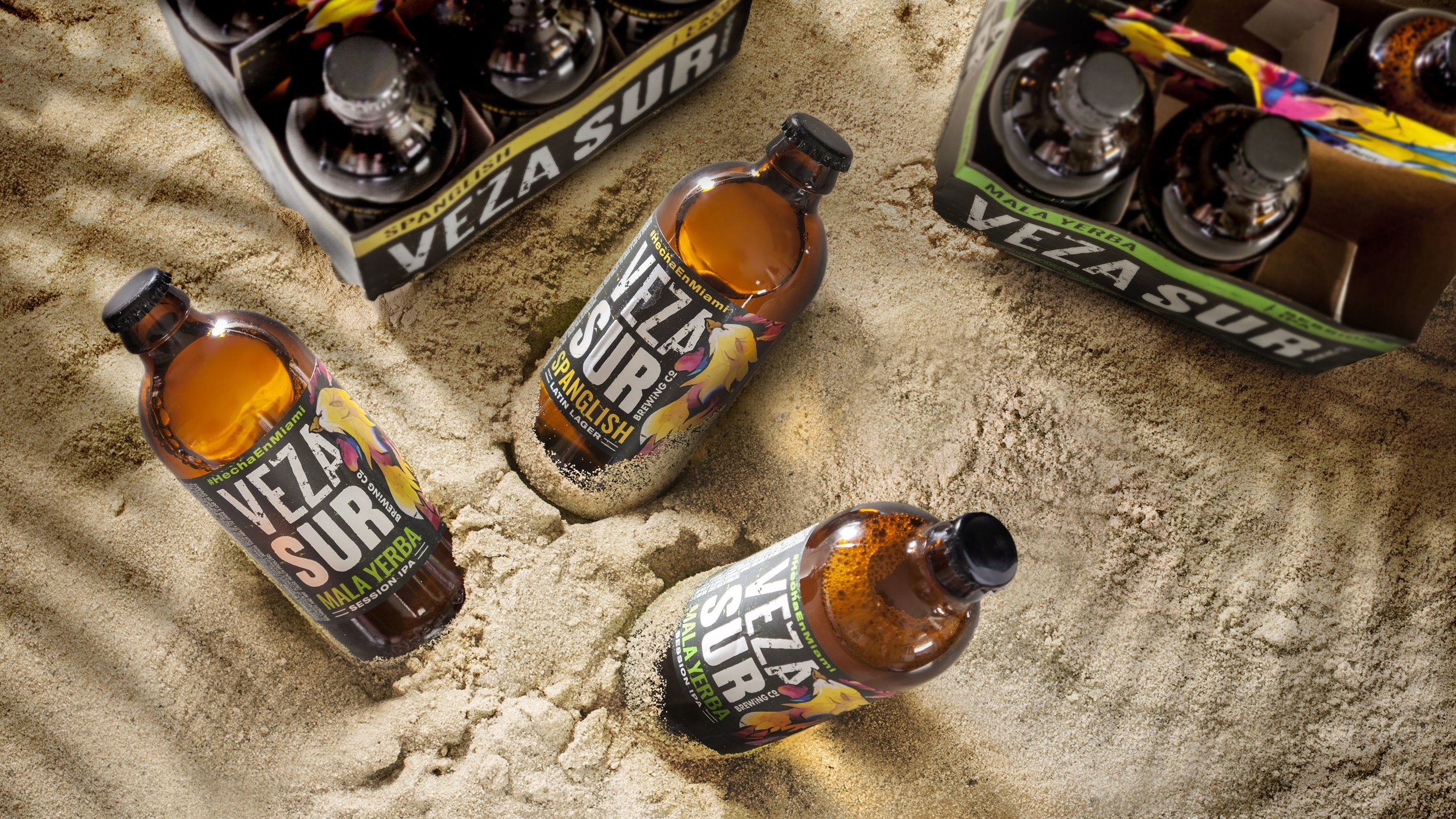
A Miami-born craft brewery scion of AB-InBev, Veza Sur was looking for a custom bottle design that spoke to the brand’s great brews and good vibes. The team at Studio One Eleven was eager to give this brand some love. The brewery gets its name from a mashup of "cerveza" and "sur" — a nod to its Colombian half. Veza Sur was inspired by the travels of the brand’s three founders who traveled to South America to explore its beer, food, and culture. With an incredibly tight launch schedule AB-InBev knew its typical design / supply partners would not be able to design, engineer and produce a custom bottle in time. Enter Studio One Eleven.

We created a short, stout, sleek amber glass bottle inspired by Miami’s melting pot of Cuban, Caribbean and South American influences. Even more impressive was the fact that in just a few short weeks we engineered the package to exceed AB-InBev’s stringent manufacturing and quality standards, secured approvals via in-house prototyping systems and shipped bottles in time for a successful launch.

New Realm

← Back to our work

New Realm Ready to Drink Cocktails

Ground Breaking Design

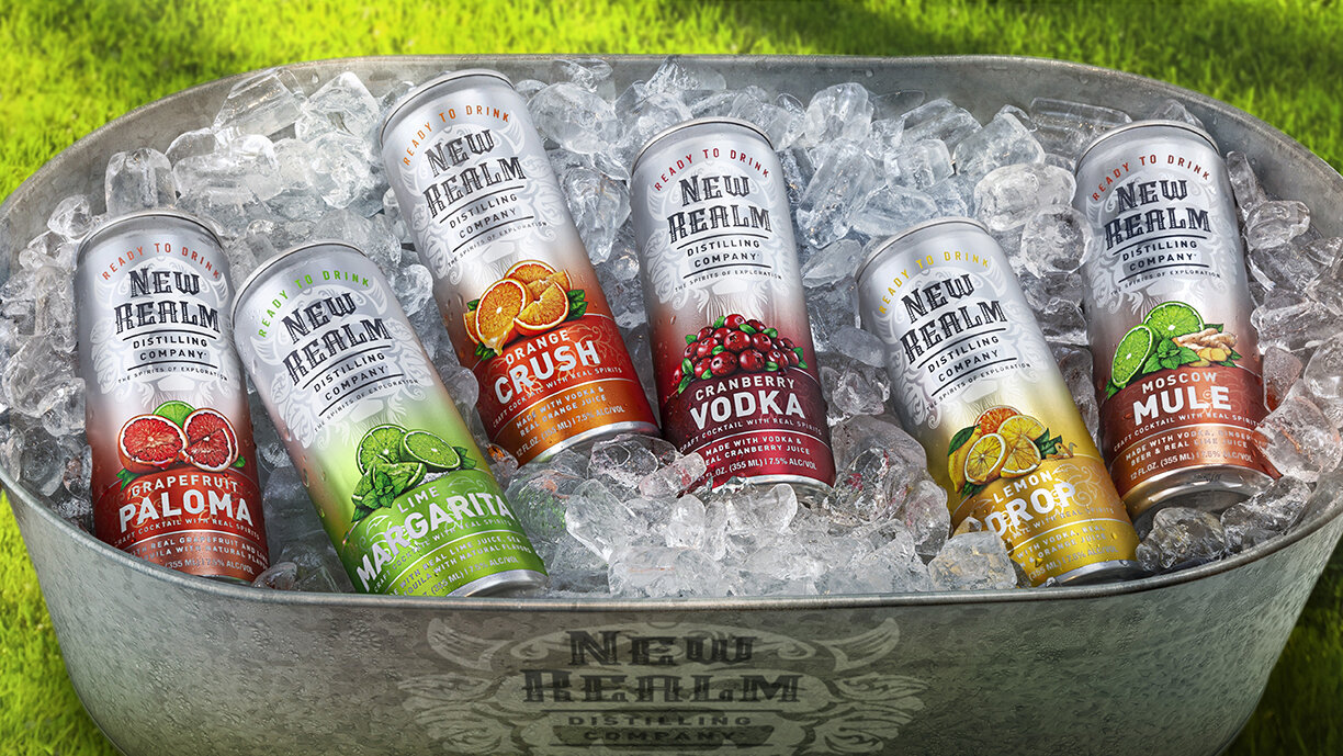
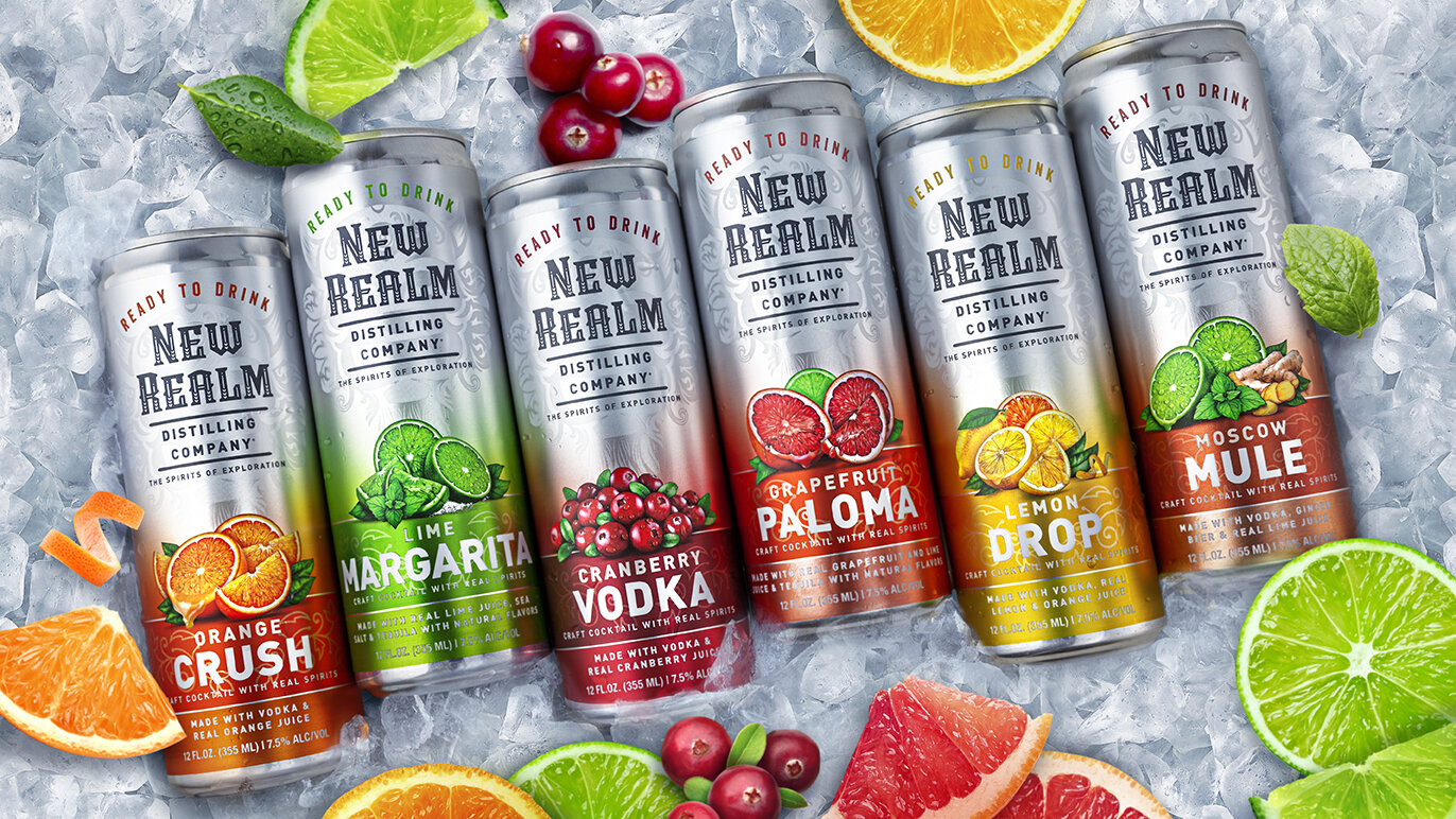
New Realm Distilling Company was founded with a mission to break new ground and break the rules of traditional brewing and distilling. It was with this pioneering spirit that they developed their line of premium ready-to-drink canned cocktails. The team at Studio One Eleven brought the brand’s story of innovative craftsmanship to life with impactful packaging graphics that stand out in the crowded RTD aisle. The design maintains New Realm’s iconic Radegast emblem as a subtle background image behind the distinguished brandmark. Ingredient imagery and bright, saturated color at the bottom of the can suggests fresh, bold flavors.

Kindred Spirits

← Back to our work

Kindred Spirits

KindredSpirits_4_Sm.jpg

Spirited Wine Design.

Following the success of their Christmas and Valentine's Day seasonal collections, American Vintners introduced, "Kindred Spirits," perfect for summer grilling and Father's Day celebrations. For this latest summertime collection, Studio One Eleven started by ideating a range of themes and developed the name “Kindred Spirits,” a nod to the featured Cask & Barrel wine brand’s ties to bourbon. The design team created simple, spirited packaging graphics that borrow cues from the spirits category including wood barrel details, earth tones, and bold fonts. Berlin Packaging sourced 187mL clear glass bottles that complement the wine varietals, with a screw top closure that makes them easy to open and reseal at home or on-the-go. This unique sampler box is sure to get everyone into the spirit of the summer season.

Frosted Star

← Back to our work

Frosted Star Vodka

FrostedStar_Hero_BB_RGB.jpg

Design that’s a Fortress to be Reckoned With.

The team at Studio One Eleven transports you to the great state of Texas with our custom package design for Whiskey Hollow Distillery’s Frosted Star.  We knew this handcrafted vodka needed a design that celebrates the history and spirit of the Lone Star state where it’s made.  We were inspired by the Alamo as an iconic symbol of the courage, tenacity, and pride of Texans.  A vintage-inspired line drawing of the fortress speaks to its heritage and legacy.  We leveraged a frosted glass bottle to add dimension and interest and incorporated the Texas flag for a pop of color.  A handwritten Frosted Star brandmark evokes a sense of history and authenticity. The result is beautiful design with a Texas-sized impact.

1800 Tequila

← Back to our work

1800 Tequila


1800 tops off new look with a custom closure.

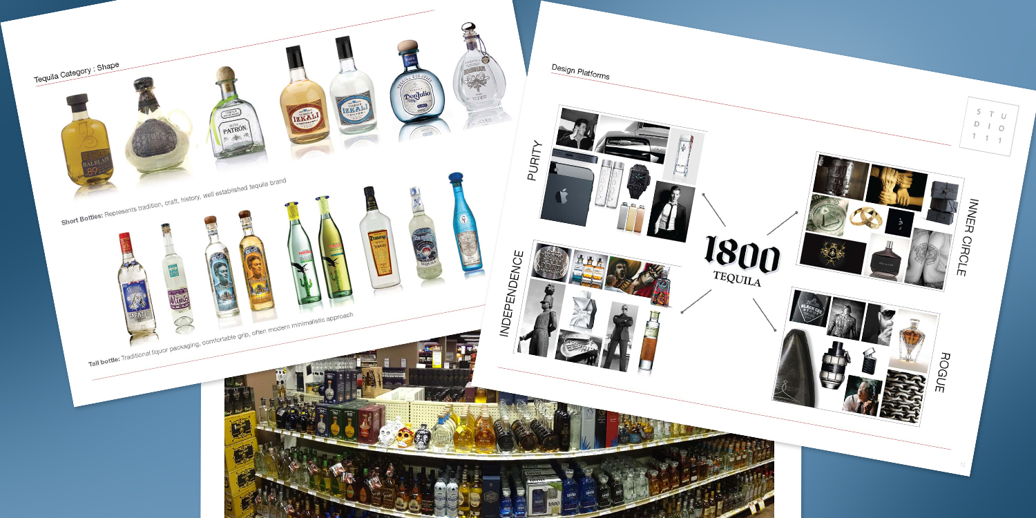
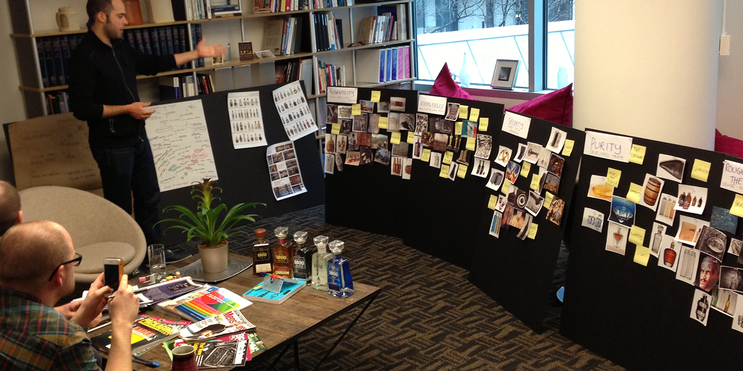
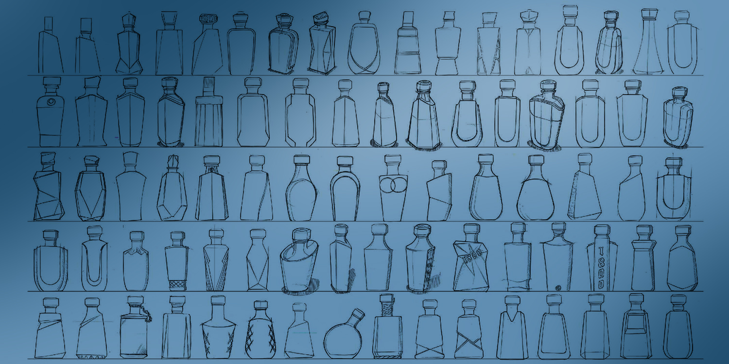
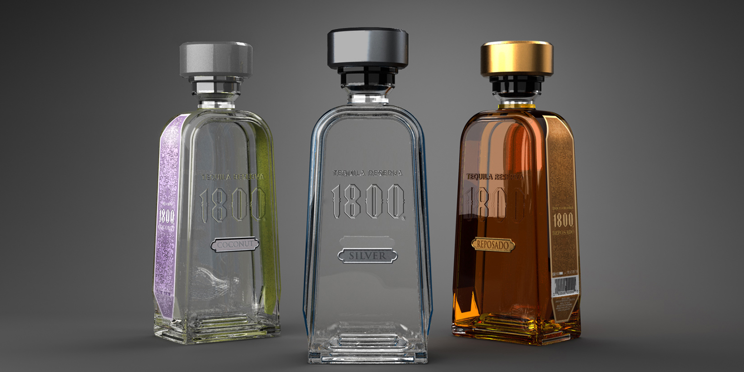
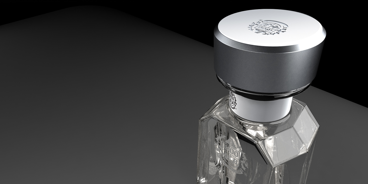
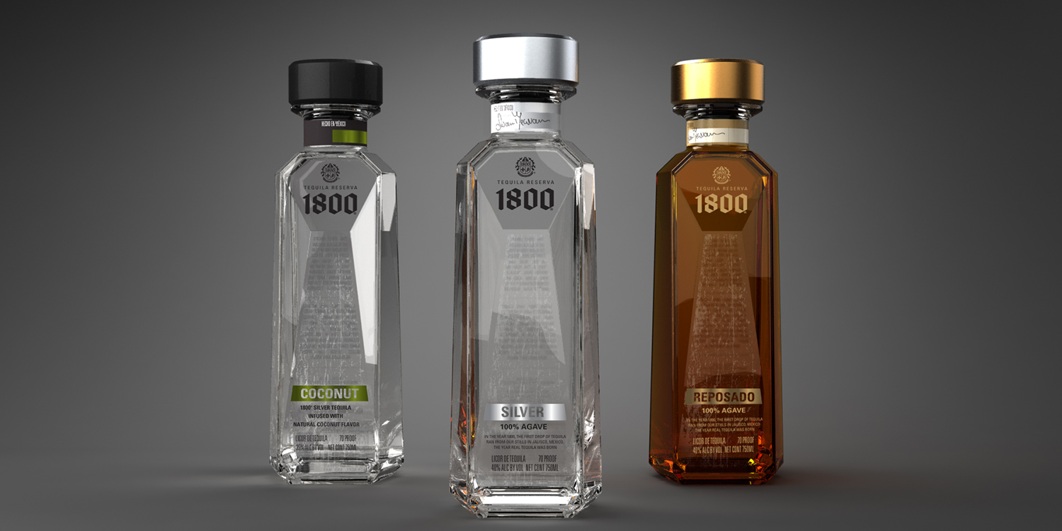
Studio One Eleven worked closely with Proximo spirits on the development of a new closure for Proximo’s 1800® Tequilla brand. Our goal for the project was to elevate the premiumness of the overall package.

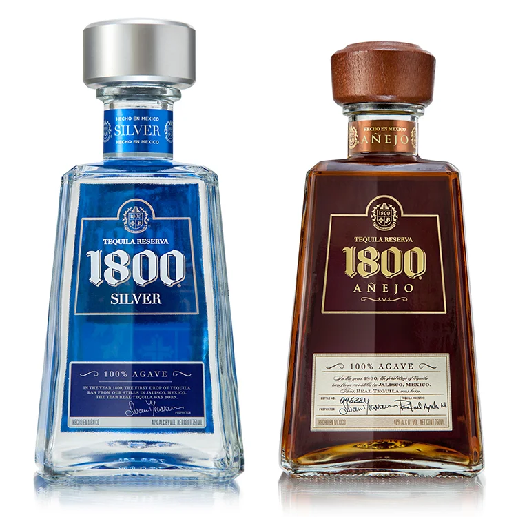
This was no small challenge, because the outgoing closure was a recognizable component of the iconic 1800 package presentation.

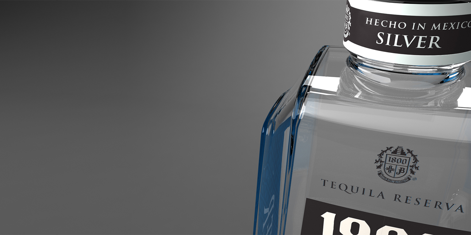
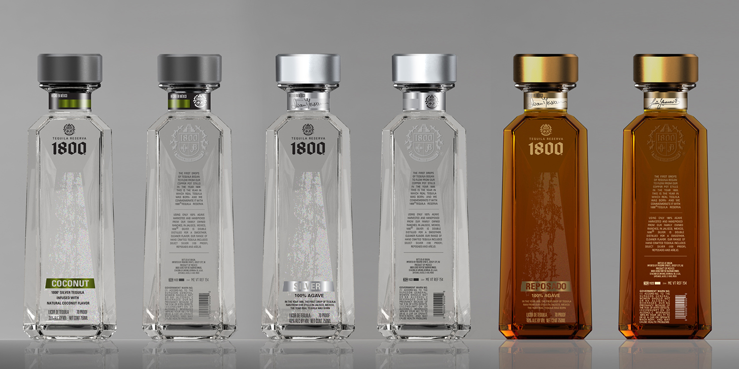
The result of our work is a closure that is both simple and refined – A better fit for 1800’s brand character that has been implemented across the Silver and Reposado SKUs.

Peace Tree Brewing’s Blonde Fatale

← Back to our work

Peace Tree Brewing’s Blonde Fatale

A refreshing redesign on a unique craft beer.

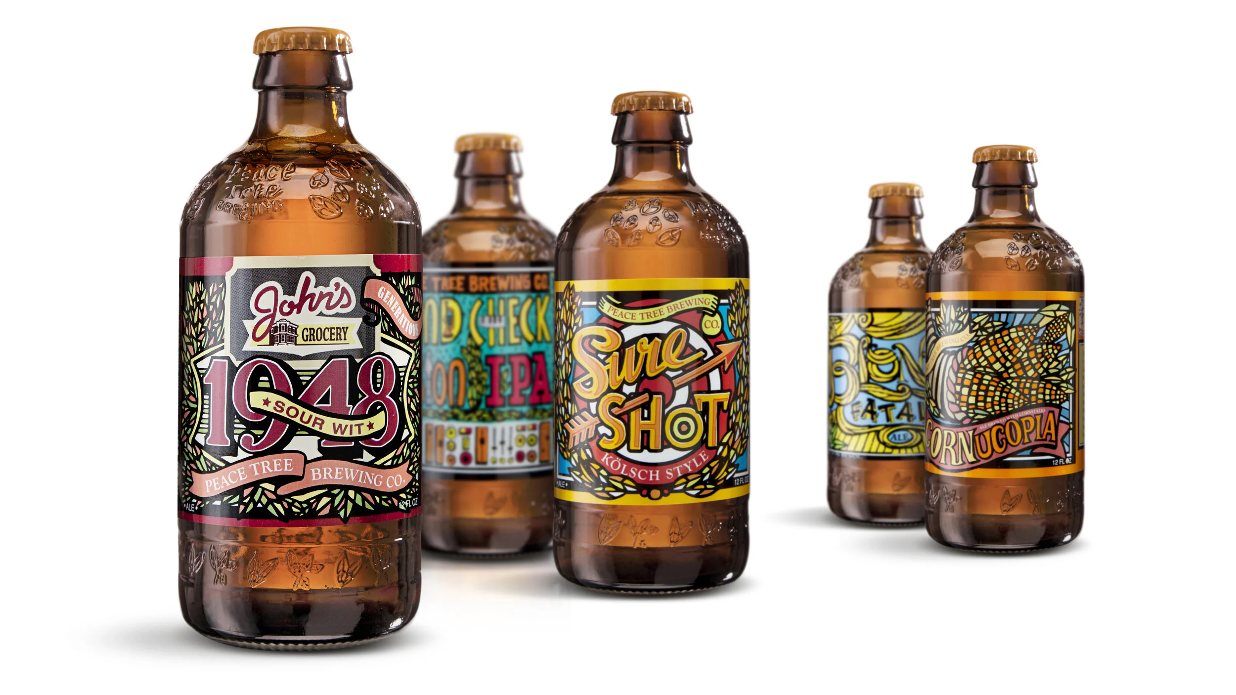
Peace Tree Brewing is a proud craft brewery that is dedicated to handcrafted, full-flavored beers with great attention to quality. Their product line consists of four flagship craft brews, as well as several seasonal and specialty beers produced throughout the year, all of which had been packaged in stock 350 mL heritage bottles.

Starting with Peace Tree’s Belgian-style blonde ale monikered Blonde Fatale, the brewery wanted to modify their existing standard bottle for better utility (achieving a true 12-ounce fill and easier opening) and better shelf impression in the competitive craft-beer market.

The new custom packaging – a stubby bottle with distinctive embossments wrapped in vibrant graphics and cartons – designed by Studio One Eleven, creates a bold shelf presence. The label and the bottle show how Peace Tree straddles classic and contemporary, with bold colors and intricate designs. And the new package fills to 12-ounces and works perfectly on the existing filling line equipment, which has allowed the company to gain efficiencies.

BJ Hookers Vodka

← Back to our work

BJ Hooker's Vodka


Chic meets cheek.

Vodka manufacturers typically try to outdo each other with ever-loftier bottle creations that convey the finesse of their product. BJ Hooker’s, a Houston, Texas-based vodka distillery with roots reaching back to Prohibition, took a different approach: a strong bottle design that features 1950’s bar advertising applied with a cutting-edge ceramic labeling process.

BJ Hooker’s is all about fun and Americana. The goal of its new bottle was to retain this playful personality using retro cocktail ads—a BJ Hooker’s signature—and present them in a way that captures the vodka’s handmade, premium quality.

To accomplish the task, Berlin Packaging and its Studio One Eleven design division created a custom glass container that sports the word “Cheers” and a silhouette of the state of Texas prominently embossed on the raised shoulder, along with another Texas logo deeply-debossed atop the bottle backside.

The company’s retro imagery was applied using ACL (Applied Ceramic Labeling), a specialized technique in which ceramic inks are fused to the bottle in a conveyor oven. The process outperforms screen printing by delivering perfect registration quality, even in the 360-degree application used for BJ Hooker’s. The finished bottle, presenting an elegant 3D effect thanks to the four-color ACL process, boldly sets BJ Hooker’s apart in a crowded product category.

BJ Hooker’s has applied the new look to all five of its package sizes. The company is also adapting the design for its new line of flavored vodkas.


Lionstone Wines

← Back to our work

Golden Design for the Golden State

Golden Design for the Golden State

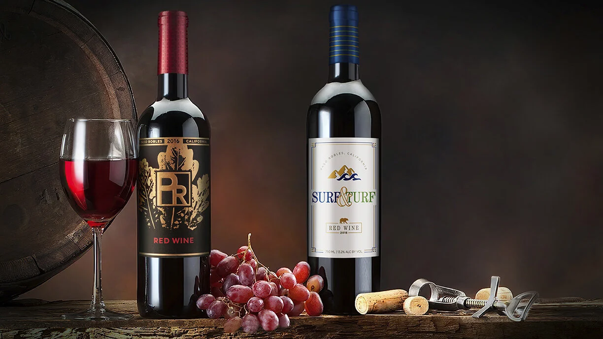
Lionstone International sources and imports exclusive, premium wines from around the world, developing delicious portfolios for subscription wine clubs.  When they needed package designs for two California reds from Paso Robles, they worked with the branding experts at Studio One Eleven.  For both labels the Studio’s design team wanted to celebrate the natural beauty and landscape that makes the region – and its wines – so special.  

PR stands for Paso Robles, a city known for - and named after - its majestic oak trees.  The Studio’s graphic designers created artwork that depicts the beauty and uniqueness of the oak leaf, creating a sense of place and authenticity for this California cabernet.  A dramatic color palette of black, gold and red reflects the wine’s robust, bold flavor, and elegant details like metallic foil and a patterned capsule suggest premium quality.   

Beyond the oak trees, California’s beautiful coastline is visible from the many hilltop vineyards that call Paso Robles home.  The area is the perfect merging of surf and turf, making the grapes grow well, and the wine taste delicious.  The Surf & Turf label design captures the essence of this beautiful and complex landscape.  The designers created simple but impactful icons and typography that complement each other as well as the land and water itself.   

Cedar Ridge

← Back to our work

Cedar Ridge

Get Whiskey’d Away with Custom Packaging

After partnering with Berlin Packaging for years to source stock bottles for their award-winning spirits, Cedar Ridge knew Berlin could help them transition to a custom structure that would elevate their Iowa Bourbon Whiskey. The in-house design and innovation team at Studio One Eleven took inspiration from the authenticity and craftsmanship of the product itself. The new design maintains the familiar round silhouette from the previous bottle but incorporates a “whiskey bulb” to better embody the spirit of bourbon. 

To reduce weight and save costs, the designers cored out the base of the bottle and increased the height of the push-up. This creates the perception of a thick base and maintains the brand’s premium image. A logo embellishment at the base of the package adds a unique touch and works without label alignment for seamless manufacturing.