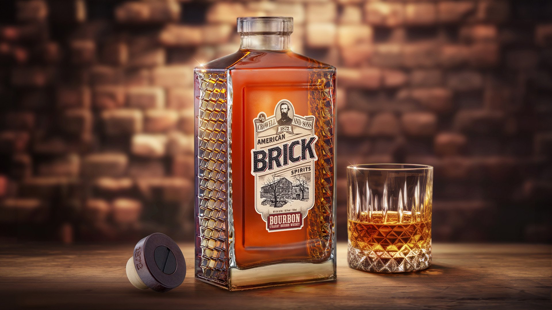
Deutsch Family Wine & Spirits partnered with father-son duo Brian and Kevin Crowell to create American Brick Bourbon. The brand pays homage to the Crowell family’s brick mold business that dates back to the Industrial Revolution. The founders wanted a brick-shaped bottle that helped bring their story to life, but it wasn’t easy to execute. That’s where Studio One Eleven came in.
Our designers started by creating a sharp rectangular bottle with a distinct texture on the sides that simulates a brick. The complex design posed some challenges due to the unique shape and pattern, so we worked to ensure a consistent distribution of glass and a thick enough wall to prevent chipping. We also faced manufacturing challenges in achieving the unusually wide cylindrical neck finish that could seal with the custom bartop closure we designed. The Studio’s Chicago and Milan teams worked closely together alongside the European bottle and closure manufacturers to review prototypes and glass samples, perform quality control, and resolve all challenges. The final result is a beautiful package that reflects the brand’s heritage and distinguishes itself in the crowded spirits aisle.
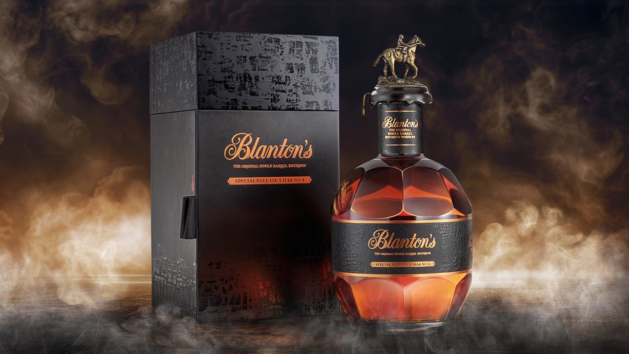
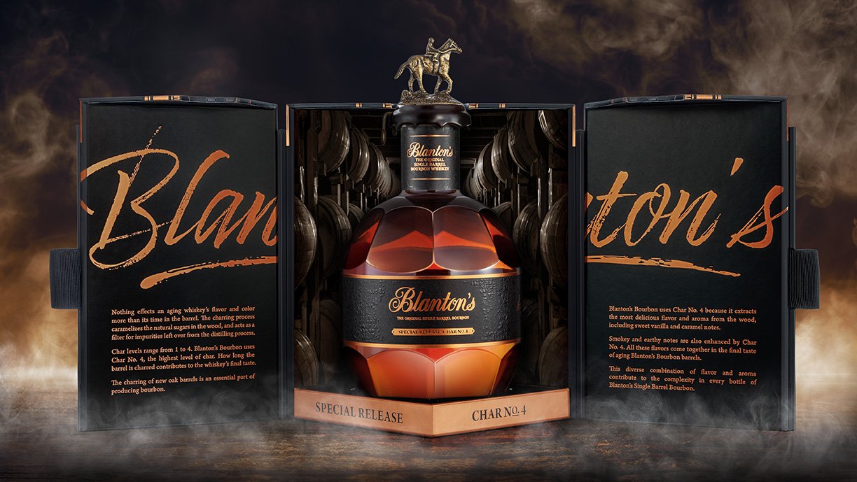
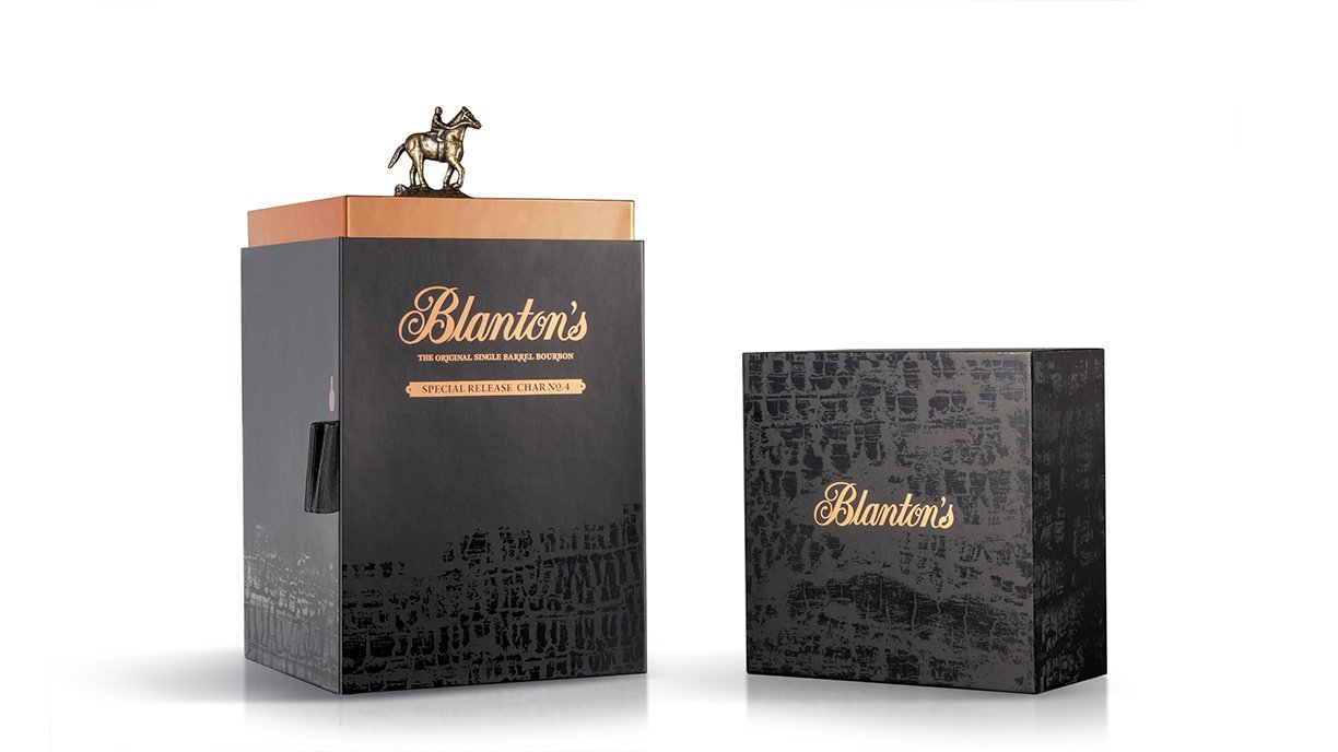
Blanton’s is a highly regarded and desired bourbon, once designated for ambassadors and dignitaries. Today, everyone has access to the world’s first single-barrel bourbon, but its legacy of quality and prestige lives on. When the brand needed ultra-premium packaging for a special-edition European launch, they turned to the cross-functional team at Studio One Eleven. We developed a custom case and brand design inspired by the barrel charring process that gives Blanton’s its distinguished taste and color. The Studio’s industrial designers started by developing a unique carton that creates a special unboxing experience and acts as a display case for this collector’s item. The carton’s top is removed to delightfully reveal the brand’s signature collectible horse stopper, standing proudly as if on a pedestal. Two carton panels swing open to showcase the beautiful iconic bottle sitting on a copper platform.
The Studio’s brand design team added a large Blanton’s brandmark to flank the bottle on each side, with a photo of the legendary Warehouse H, the aging place of all Blanton's Bourbon, featured in the background. The charcoal gray color and texture on the outside of the case evoke the barrel staves used to make the bourbon. The Studio’s branding, industrial design, and project management teams partnered with Berlin Packaging’s Global Sourcing and Global Logistics groups to achieve their vision and bring the design from concept to commercialization.
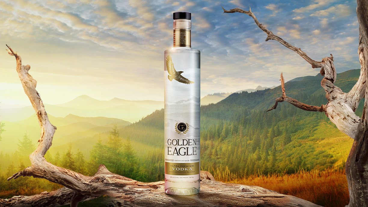
Distilled in the Big Sky region of Montana with estate-grown red wheat, Golden Eagle provides excellence from seed to sip. The brand’s elevated standards can be tasted in their ultra-premium vodka and are reflected in their elegant label design. Studio One Eleven created branding that captures Golden Eagle’s spirit of celebration and elevation. A soaring golden eagle acts as an iconic focal point on the bottle, representing tradition, luxury, and pride. The majestic, graceful bird flies high over Hollowtop Mountain, showcasing the brand’s origins and unique terroir. Wheat field imagery can be seen in the background, depicting the product’s high-quality ingredients found exclusively in the Montana mountains.
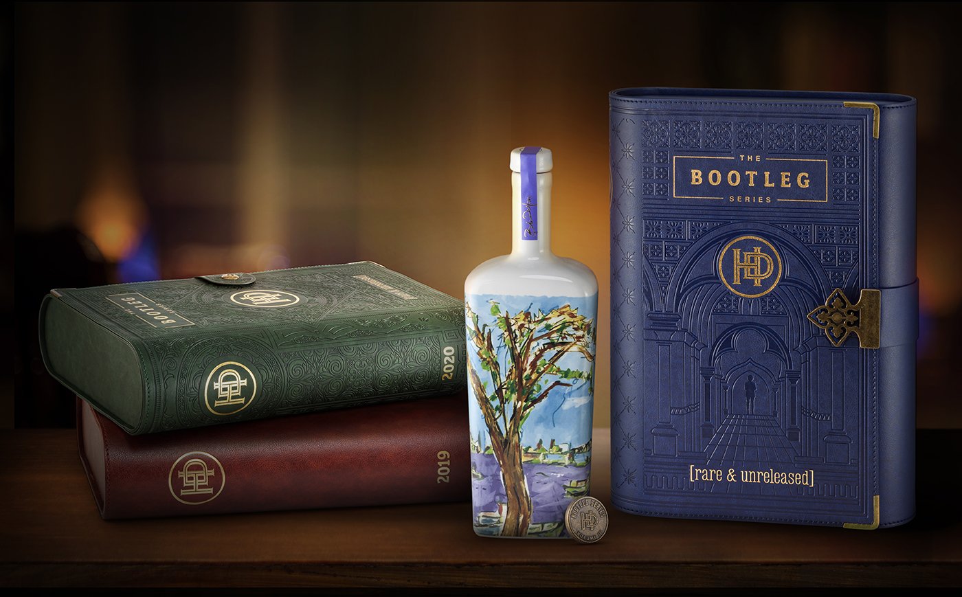
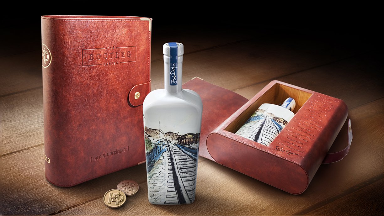
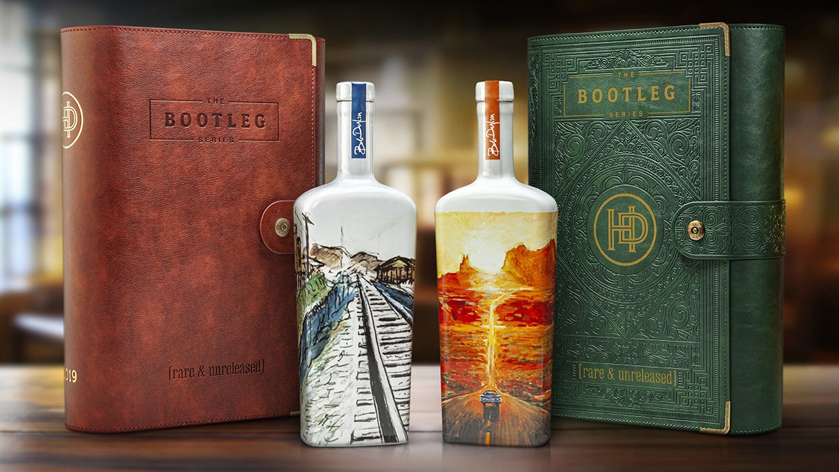
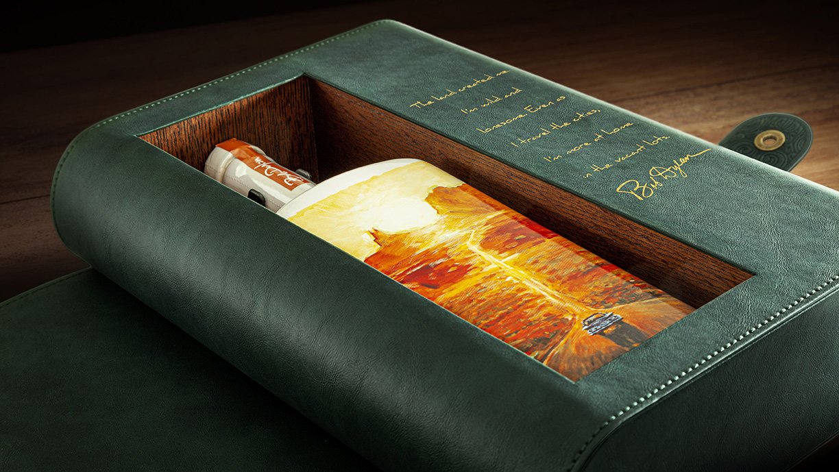
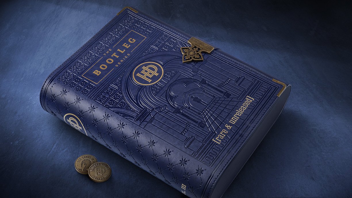
Named after Bob Dylan’s famous album collection, the Bootleg Series by Heaven’s Door celebrates the art and craft of whiskey, as well as the ingenuity of the artist himself. When the brand was ready to introduce a new annual limited-release product, they asked the team at Studio One Eleven to bring this story of artistry and creativity to life. Inspired by Bob Dylan’s journals filled with his artwork, sketches, music, and writings, our designers created a leather journal to showcase the Bootleg Series’ unique whiskeys. Embossing and gold accents add authenticity and create a sense of history and heritage. The case opens to reveal a ceramic bottle decorated with one of Bob Dylan’s original paintings.
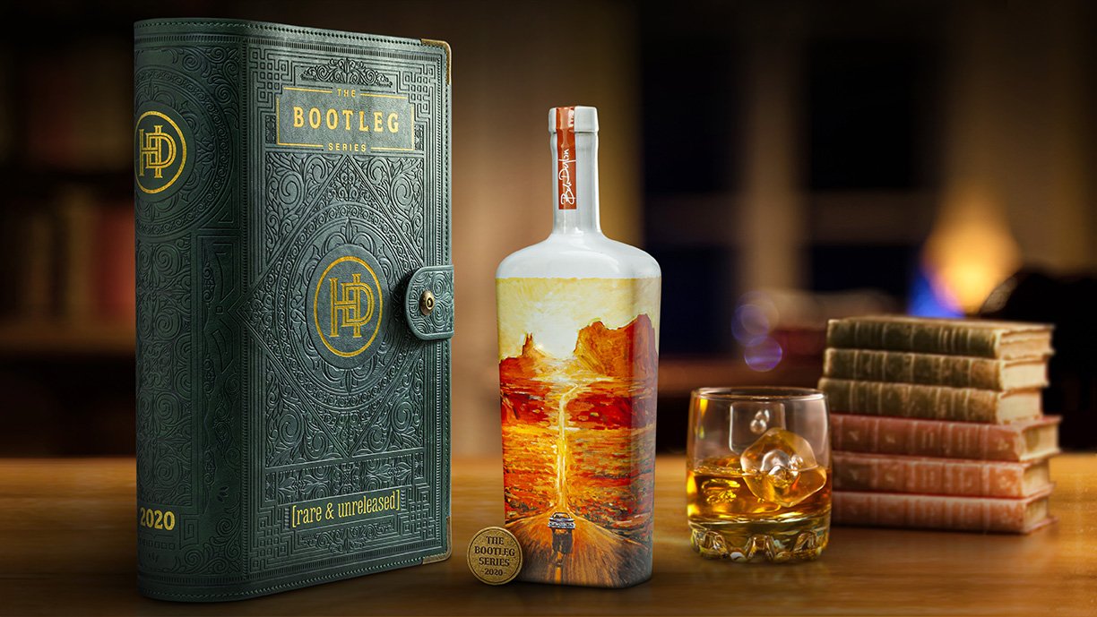
Each year’s journal and bottle have their own unique custom design, allowing collectors to celebrate anew the creativity and craftsmanship of both Bob Dylan and The Bootleg Series. The second edition features an ornate pattern inspired by ancient gothic texts. An elaborate design is embossed in gold foil on a deep teal background that evokes an aged patina finish. This new design reflects the product’s premium price point and differentiates from the original release with a sophisticated take on old-world elegance.
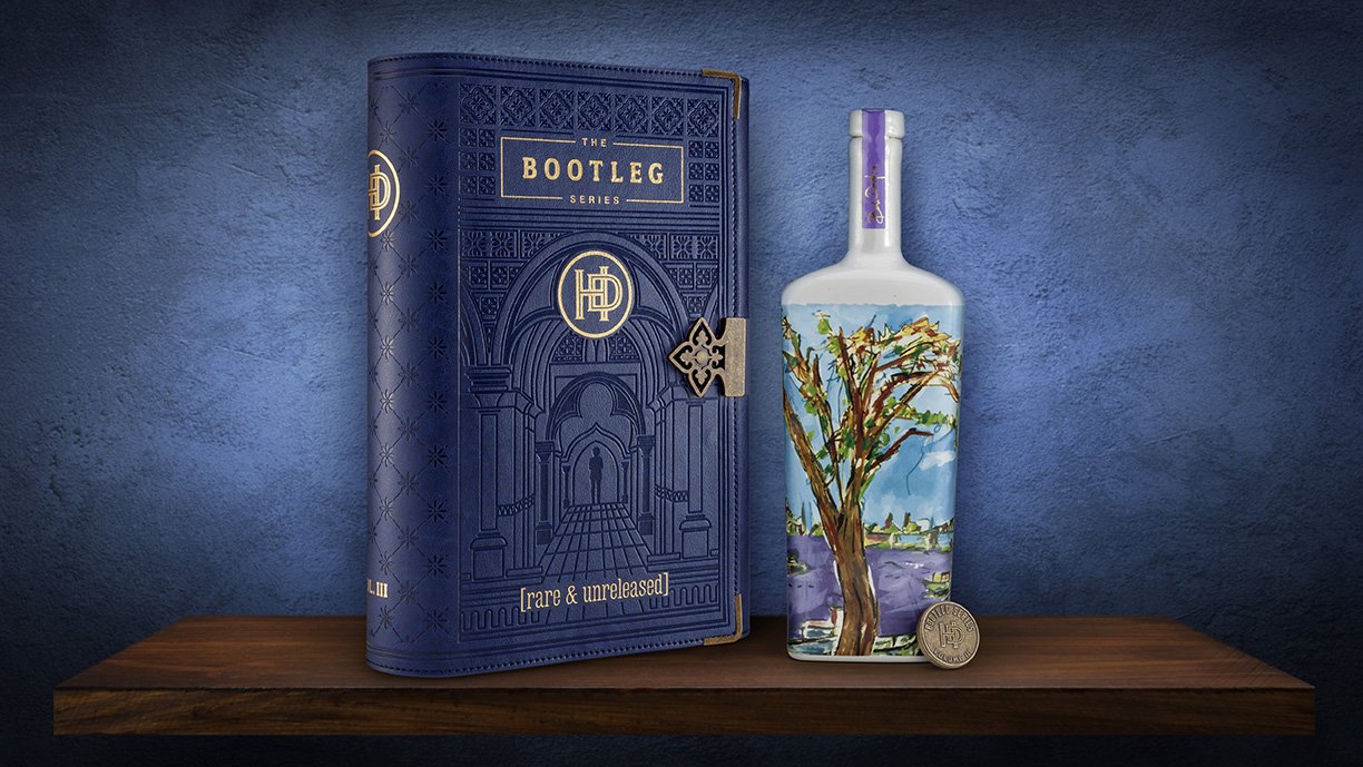
The third edition released in 2021 houses a domestic whiskey distilled in Spanish barrels, so the Studio One Eleven team took design inspiration from Spain. They created an intricate pattern suggestive of Spanish art and architecture. The rich, regal blue color is further elevated with gold accents that add dimension and distinction.
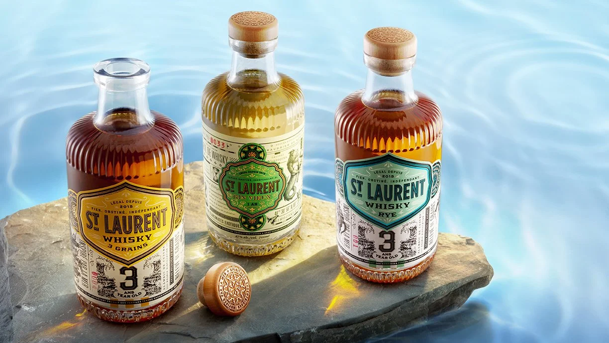
Canadian Distillerie du St. Laurent crafts eccentric spirits inspired by the sea. They describe themselves as proud, stubborn, and independent and wanted their packaging to reflect that same spirit. The team at Studio One Eleven knew they needed to create something big and bold for this brazen brand. We designed an extra wide bottle with a broad neck and heavy glass foot that creates an imposing presence and leaves a lasting impression. We added ribs around the bottle to reflect the brand’s gin-based roots. An embossment on the punt acts as the finishing touch for this big, beautiful bottle.
After successfully creating a custom bottle for LeVecke Corporation’s Hawaiian vodka brand, Pau Maui, the company returned to Studio One Eleven for help with their Fid Street Gin package. Fid Street is Hawaii’s only gin, named for the place where British sailors would drink when they arrived during the 19thcentury. With a goal of taking this regional brand mainstream on the mainland, our structural design team wanted to evoke a sense of the islands while creating broad appeal. The custom tinted turquoise glass suggests cool refreshment while alluding to the sea with a hammered, rippled texture. Debossed label panels and a neck band allow for graphics that speak to the colonial influence that inspired the brand. The Studio’s industrial design experts helped Fid Street navigate complicated waters, overseeing the complex manufacturing processes needed to achieve both the perfect custom color and texture. The final design is as one-of-a-kind as Hawaii itself.
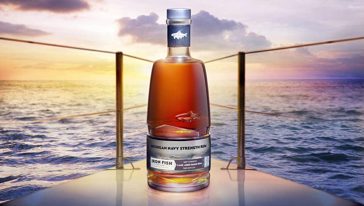
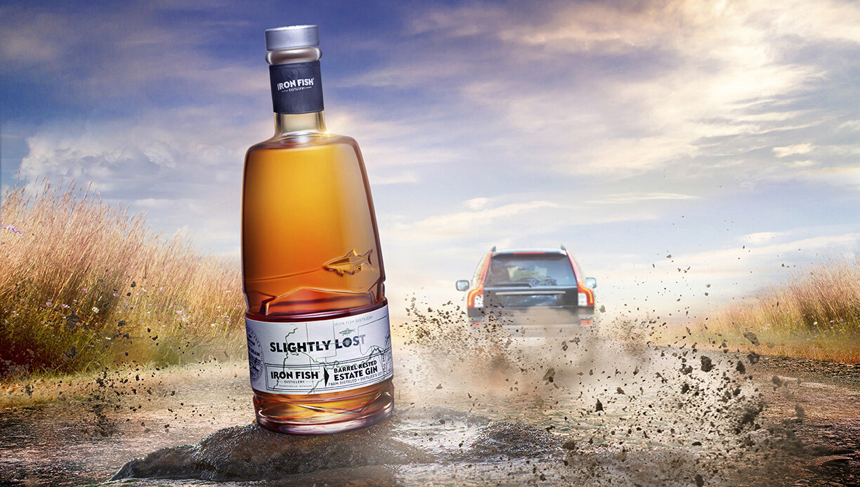
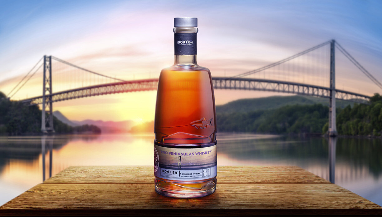
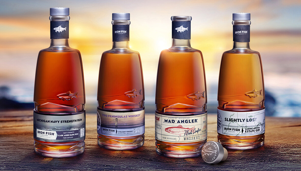
Iron Fish is Michigan’s first farm-based distillery, born on the waters of the Betsie River. Their Estate Series honors the natural resources that are at the heart of the distillery’s origins. These high-quality spirits are made with grain grown on the property and pay homage to the nearby watershed, and its steelhead, that inspired the brand’s name. When the company needed unique packaging for this special series, they partnered with the design experts at Studio One Eleven. Our team started by creating design platforms influenced by the land, water, and people that are all a part of Iron Fish’s heritage. The selected design leverages the stock bottle shape used for the distillery’s other products, but with a taller, more slender silhouette for an elevated aesthetic. The designers incorporated a label inspired from 1940's vintage fishing licenses. The company’s distinct steelhead logo is sculpted into the bottle as another premium detail, adding dimension and strengthening the brand equity. The final design reflects the distillery’s regional roots and premium quality.
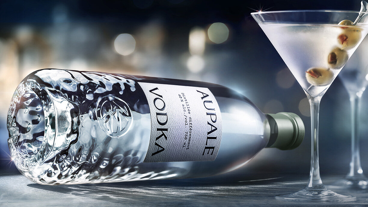
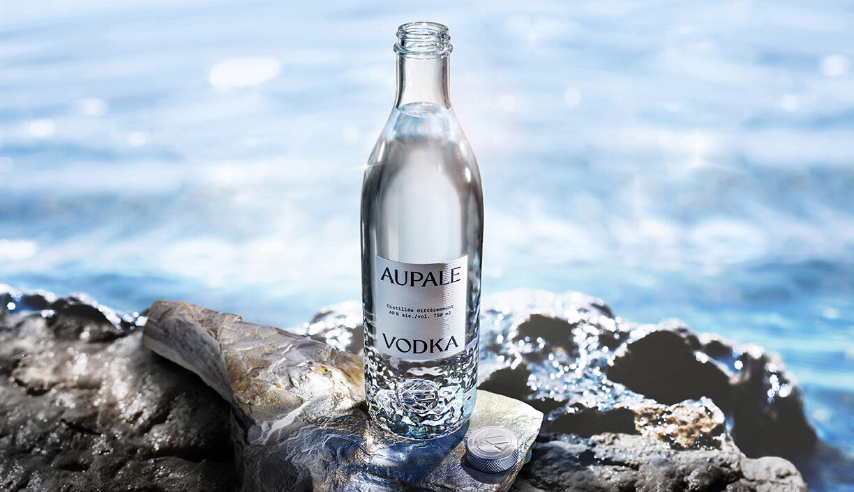
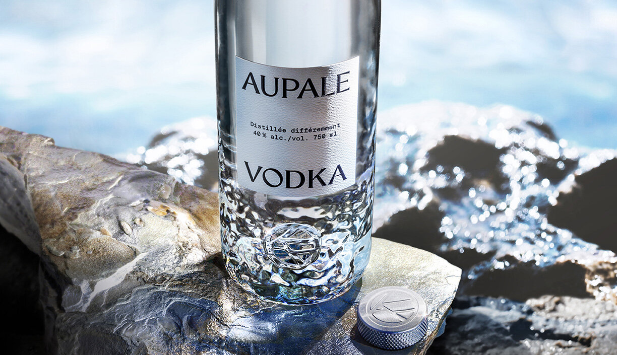
With its smooth taste and silky mouthfeel, Aupale epitomizes elegance. Crafted from the finest Canadian corn and North America’s purest glacier spring water, this deliciously uncomplicated vodka was inspired by the wild beauty of northeastern Quebec, and crafted for anyone who appreciates fine spirits. To create a bottle as distinct and distinguished as their vodka, Aupale worked with Studio One Eleven. Our designers brought the brand team’s vision to life by commissioning an artist to hand-sculpt icy waves that catch the light and evoke a beautiful Canadian winter. The pattern was carefully optimized for manufacturability, without losing the impactful design. The bottle’s unique details, graceful curves, and embossed branding create a final design that’s as cool as ice.
Blackland Distillery had a bottle design in mind for their new Texas gin, but they wanted to make sure it reflected the brand’s true colors. That’s where Studio One Eleven and Berlin Packaging came in. Our design team took Blackland’s preliminary design concept and optimized it for manufacturability and commercial efficiency, revising the neck finish and adjusting the label panel to better harmonize with the graphic treatments. Our manufacturing, sourcing and quality assurance expertise made the typically challenging color-matching process a smooth one for Blackland, ensuring production quality that exceeded expectations for a family of packages that are ‘right on hue’.
“We were having a tough time with a glass manufacturer who was taking too long to execute our vision. Berlin Packaging and Studio One Eleven were able to seamlessly bring the bottle to life.”
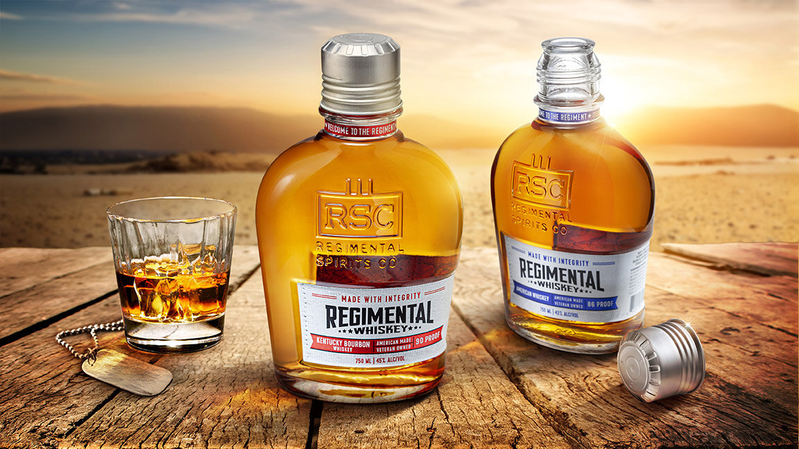
When military veterans Eric Dinoto and Kyle Moore decided to launch a new whiskey brand, Regimental Spirits Company, the team at Studio One Eleven was honored to create custom packaging for them. Inspired by the armed forces and those who serve, our industrial designers started by developing a one-of-a-kind canteen shaped bottle that is both meaningful and impactful. An embossed brandmark and debossed wrap-around label panel add dimension and distinction. Next, they partnered with our engineering team to develop a custom neck finish and closure that perfectly complement the unique bottle silhouette. Our brand designers added graphics that speak to the brand’s military heritage with a canvas texture, strong bold brandmark, battle flag graphic, and patriotic colors. This multi-disciplinary project resulted in a final package that breaks rank with convention.
“In the military we call it ‘attention to detail.’ Every nuance needs to be just right and the package is everything. That’s why we went with Berlin, because they’re the best. How the design got to where it is now could not be a better representation of who we are and what we represent. It immediately resonates with our target market. There are so many different touch-points from the bottle shape to the cap to the embossments. The design is quality, premium, unique and truly disruptive. The incredible consumer feedback and engagement has allowed us to accelerate our growth plans.”
— Regimental Spirits Company Co-Founder and CEO, Eric J. DiNoto
To create packaging for West Michigan Rum’s Burl & Sprig brand, our design team took a journey into the unconscious mind to unlock the imagination and see what dreams are really made of. Inspired by the co-owner’s art background and love of surrealism, we wanted to play with the juxtaposition of dreams and reality. We partnered with artists from all over the world to create one-of-a-kind pieces for each product within the line. We married the surreal artwork with a simple band for branding. A unique wood texture fingerprint brandmark speaks to the uniqueness of dreams as well as each artist leaving their individual mark. The final design is truly what dreams are made of!
“I absolutely love the design and the direction that the brand took. It definitely sets us apart from everyone else. We just went into distribution in July and the feedback on the packaging has been extremely positive. A lot of variables went into finding the right artwork for the bottles and I’m really happy with how it turned out. We’re planning to launch 6 new products and have already begun looking for new art.”
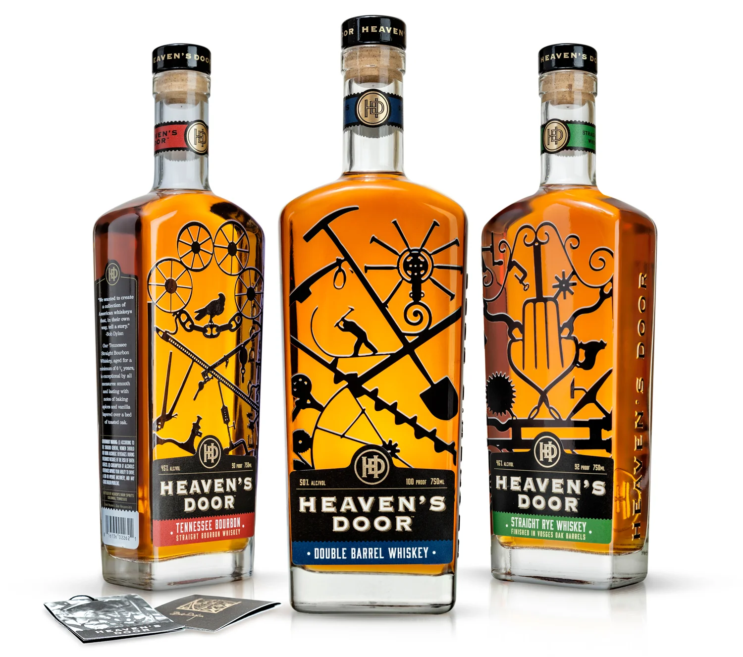
Heaven’s Door, a small-batch collection of handcrafted American whiskeys developed in partnership with Bob Dylan, called on Studio One Eleven to bring their unique vision to life.
Tasked with taking a mock-up to a manufacturable bottle that other glass molders deemed too difficult to execute, our team worked with the client to translate Dylan’s unadulterated vision to the shelf. Needing a few tweaks to the structure, while still maintaining the original design intent, the new bottle serves as the perfect vessel for the line of whiskeys that has well-defined personalities and robust flavor profiles.
The custom rounded-shoulder bottle shape features Dylan’s distinctive iron gates that he created in his studio, Black Buffalo Ironworks, from objects found on farms and scrapyards across America. With a custom "HD" embossed bar top closure, the total package translates to a premium spirit with an artistic soul.
When Michael David Winery wanted to rejuvenate their namesake brand of premium wines, new packaging was the perfect way to elevate their portfolio. They wanted to emboss their bottles with unique graphics, but didn’t know how to bring their idea from concept to completion. The team of designers and engineers at Studio One Eleven had the glass expertise to make it happen. They took the client’s original vision and optimized it to meet the challenging technical requirements for embossment. The final result is a heavily decorated custom glass bottle that maintains the integrity of the brand’s original vision, while overcoming all manufacturing hurdles. The beautiful bottle will be used for the entire portfolio of red, white and rose wines, in antique green and flint glass.
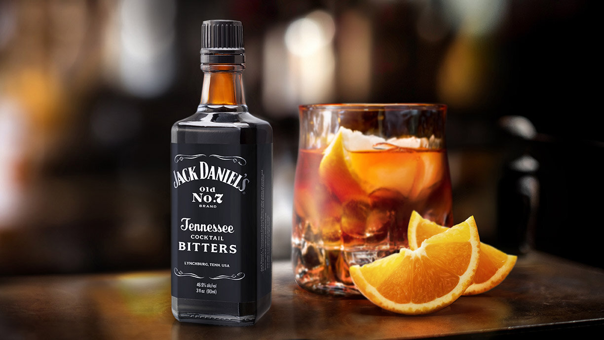
There are few American brands more iconic than Jack Daniels. So when Bourbon Barrel Foods approached Studio One Eleven to design a custom bottle for a Jack Daniels branded bitters, we knew how important it was to create a package that lives up to the name and its legacy. The industrial design team was challenged with developing something that was unique for the bitters, while also fitting in with the rest of the Jack Daniels portfolio. The custom 3 oz. amber bottle borrows cues from the brand’s flagship whiskey bottle, including a chamfered square body and faceted neck, but modified to feel distinctly like bitters. The tall, thin package aligns with the brand, while differentiating from the spirits. The Studio’s graphic designers created a label that maintains the iconic black and white color palette and typography, while clearly communicating the Bitters message. The final package is fit for an icon.
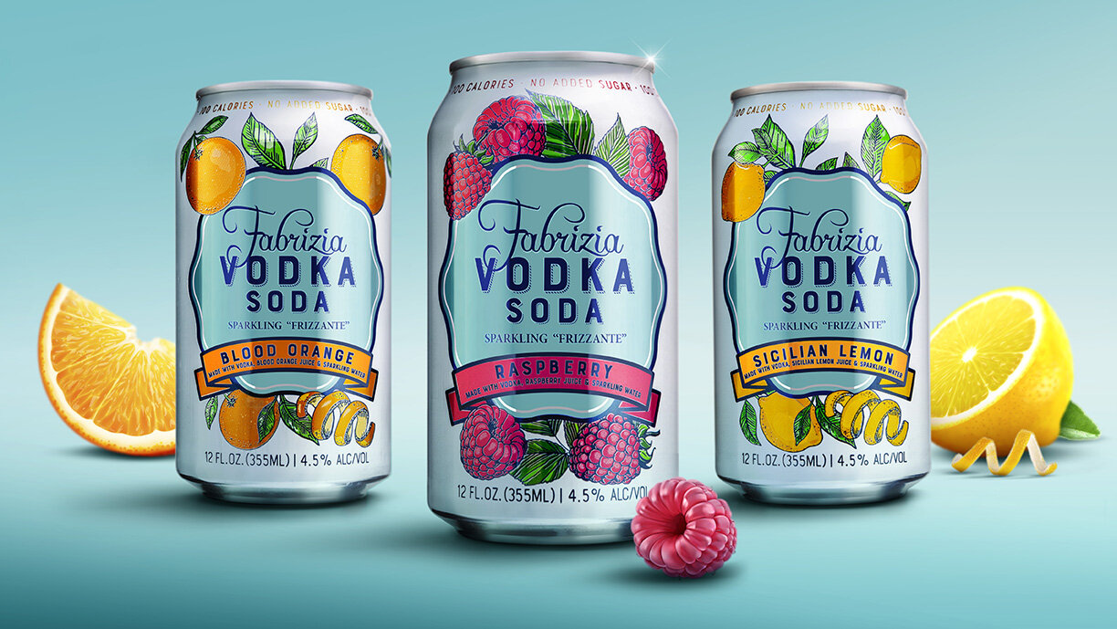
Family-owned Fabrizia Spirits was founded with a respect for “the old country” and the delicious Sicilian lemons that grow there. When the company decided to launch a new line of vodka sodas, they partnered with the team at Studio One Eleven to create beautiful packaging that celebrates the brand’s quality ingredients and authentic Italian roots. The graphic designers started with hand-drawn fruit illustrations that reflect the artisanal craftsmanship that goes into each cocktail. They surround an organically-shaped blue seal that houses a simple brandmark, differentiating these sodas from the company’s other products. The white and blue color palette feels clean and refreshing, while color-coded flavor banners improve shoppability in the crowded ready-to-drink beverage aisle. When life gives you lemons…create something beautiful!
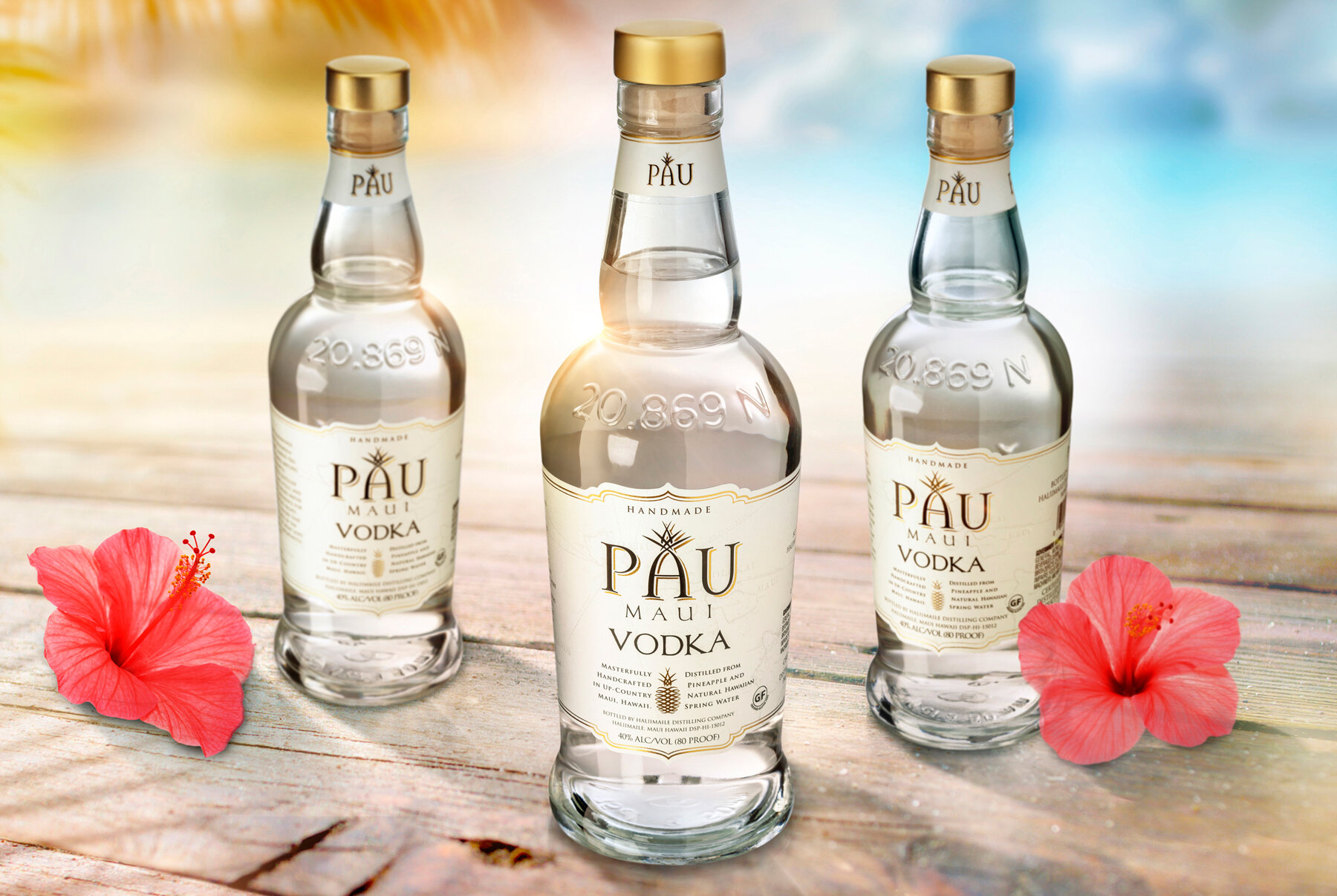
When LeVecke Corporation needed to redesign the bottle for their amazing Hawaiian-made vodka, the team at Studio One Eleven dove into the project with both feet. Our designers optimized the original 750mL glass bottle design, creating a silhouette that combines an evolved brown spirits bottle neck and a flared base for faster line speeds and more cost-effective manufacturing. PAU Maui Vodka is distilled in Hawaii using Maui Gold pineapples, Hawaiian spring water and unique glass stills, so in reference to these forms we added a plump bulbous shoulder to tie the whole presentation together. As finishing touches that add little moments of discovery and delight, we embossed a stylized pineapple motif and the distillery’s nautical coordinates – an homage to the ingredient story and a celebration of Maui’s natural resources.
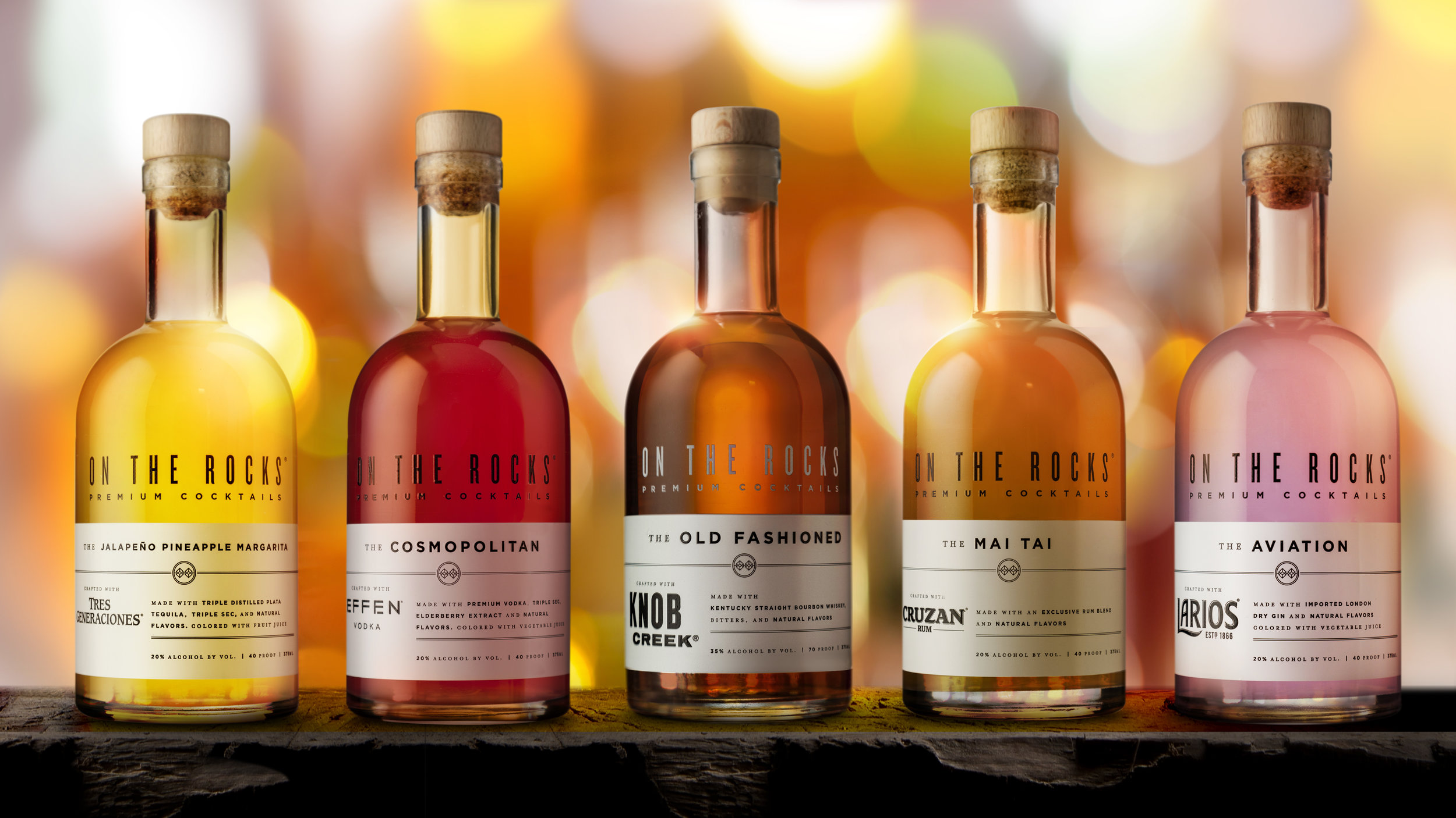
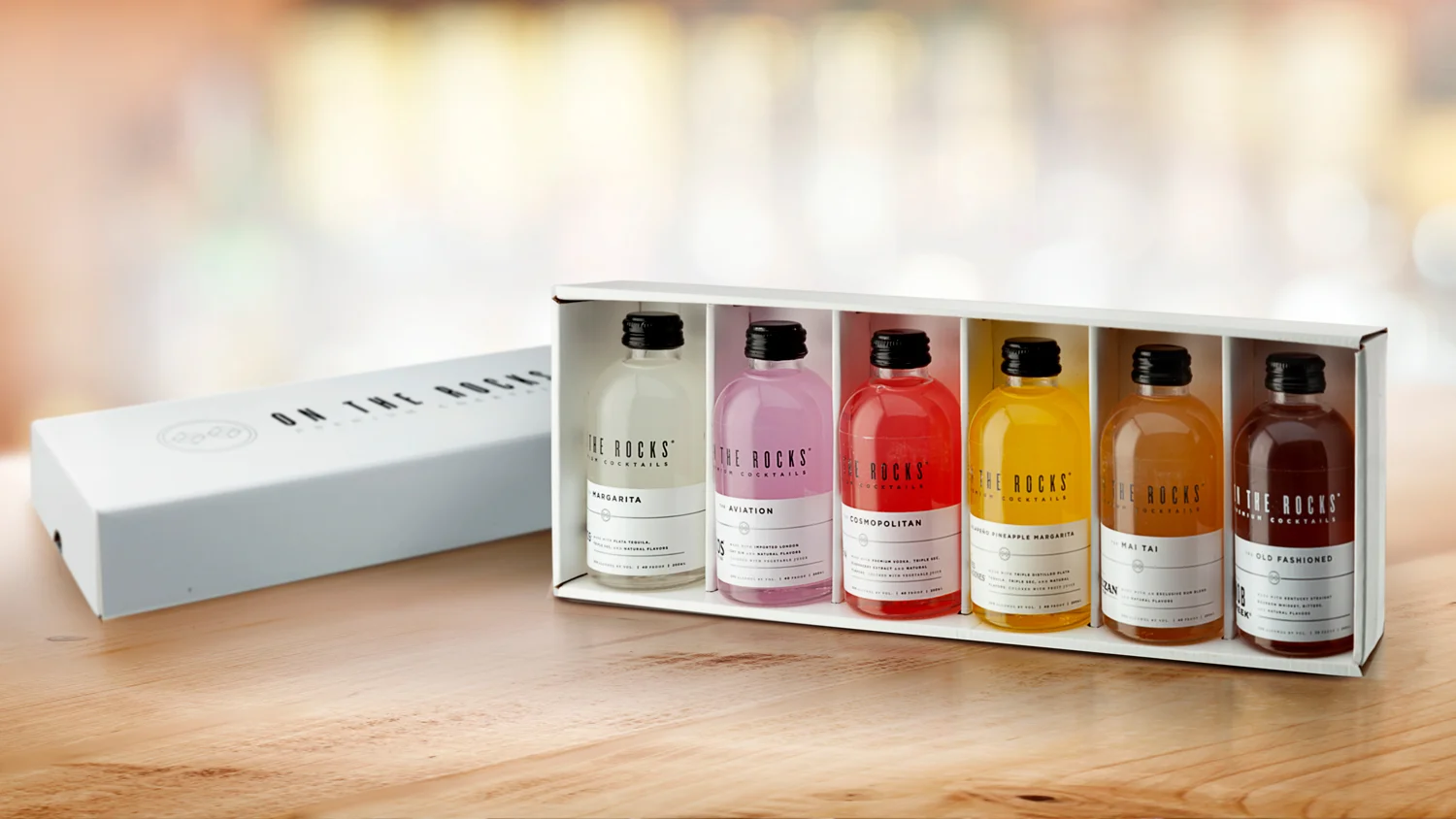
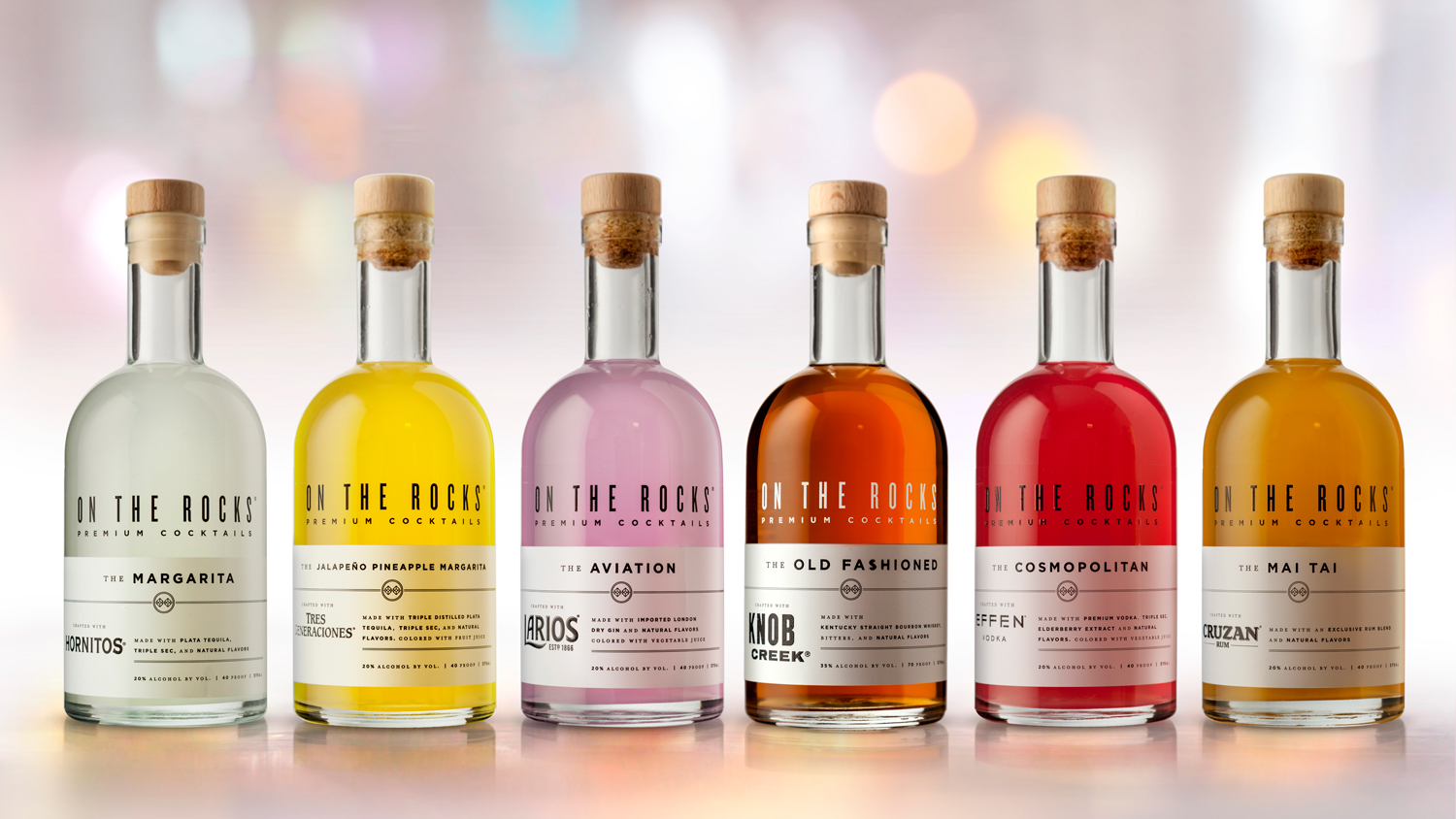
When the mixologists at On the Rocks developed their delicious line of pre-mixed cocktails, they knew they needed to shake things up with show-stopping packaging that lived up to their mouthwatering product. Keeping both aesthetics and manufacturing efficiency in mind, the experts at Studio One Eleven designed a series of bottles that are as easy on the eyes as they are on the production line. With a mix of glass and PET that blend together tastefully, the bottles suit the entire portfolio, standing out everywhere from the minibar to the mini-mart. Our design team created clean, impactful packaging that matches the smoothness of the cocktails… for the perfect pairing.
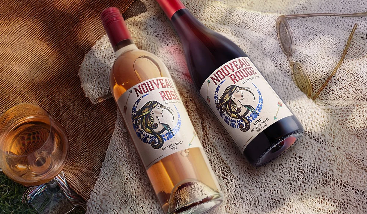
Nouveau Rouge means “first red.” Made by Chateau Diana Winery, along with Nouveau Rose, these are the “first wines” of the vintage, fermented for just a few weeks before bottling to create light, delicious, fruity flavor. The brand is named after Diana, the Roman goddess of the hunt, who sought adventure and lived with abandon. The branding team at Studio One Eleven used her as inspiration for the wine’s bold and beautiful label design. They started by creating an art nouveau-style portrait that captures Diana’s venturesome spirit, with her hair flying freely around her confident profile. She is enveloped by the bow she wielded and her arrows fly across the bottle. Her image embodies the fresh, fruity, unadulterated flavor of this easy-drinking red zinfandel.
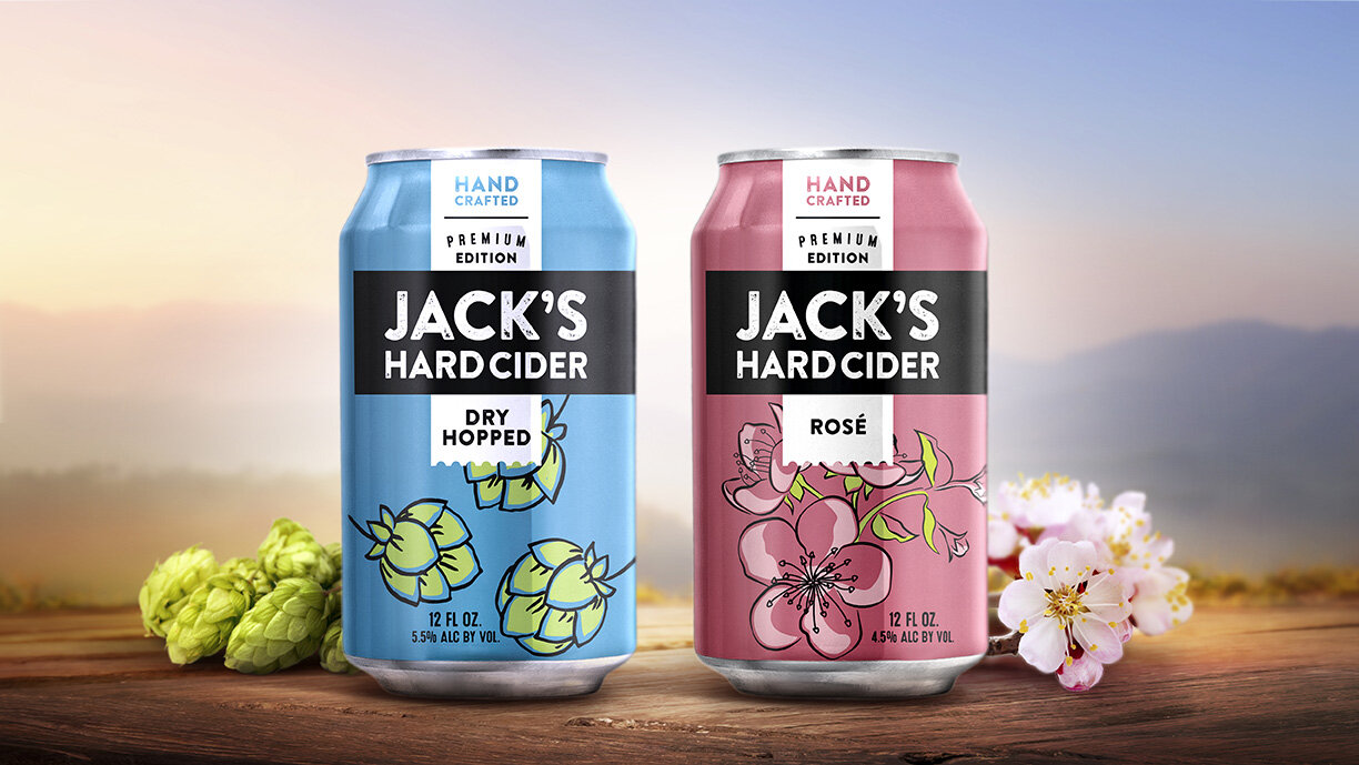
Hard-pressed and handcrafted, Jack’s Hard Cider is committed to bringing people together over a good drink. So when they wanted to expand the brand to include a new line of premium ciders, the packaging needed to embody the brand’s artisanal spirit while standing out as something new. The design team at Studio One Eleven started by putting the existing brandmark in a bold black bar that differentiates from the original flavors and stands out at the shelf. They created a white banner graphic that speaks to artisanal craftsmanship and premium quality. Fun, bright colors and whimsical illustrations speak to the ingredient story, as well as the upbeat brand mission.
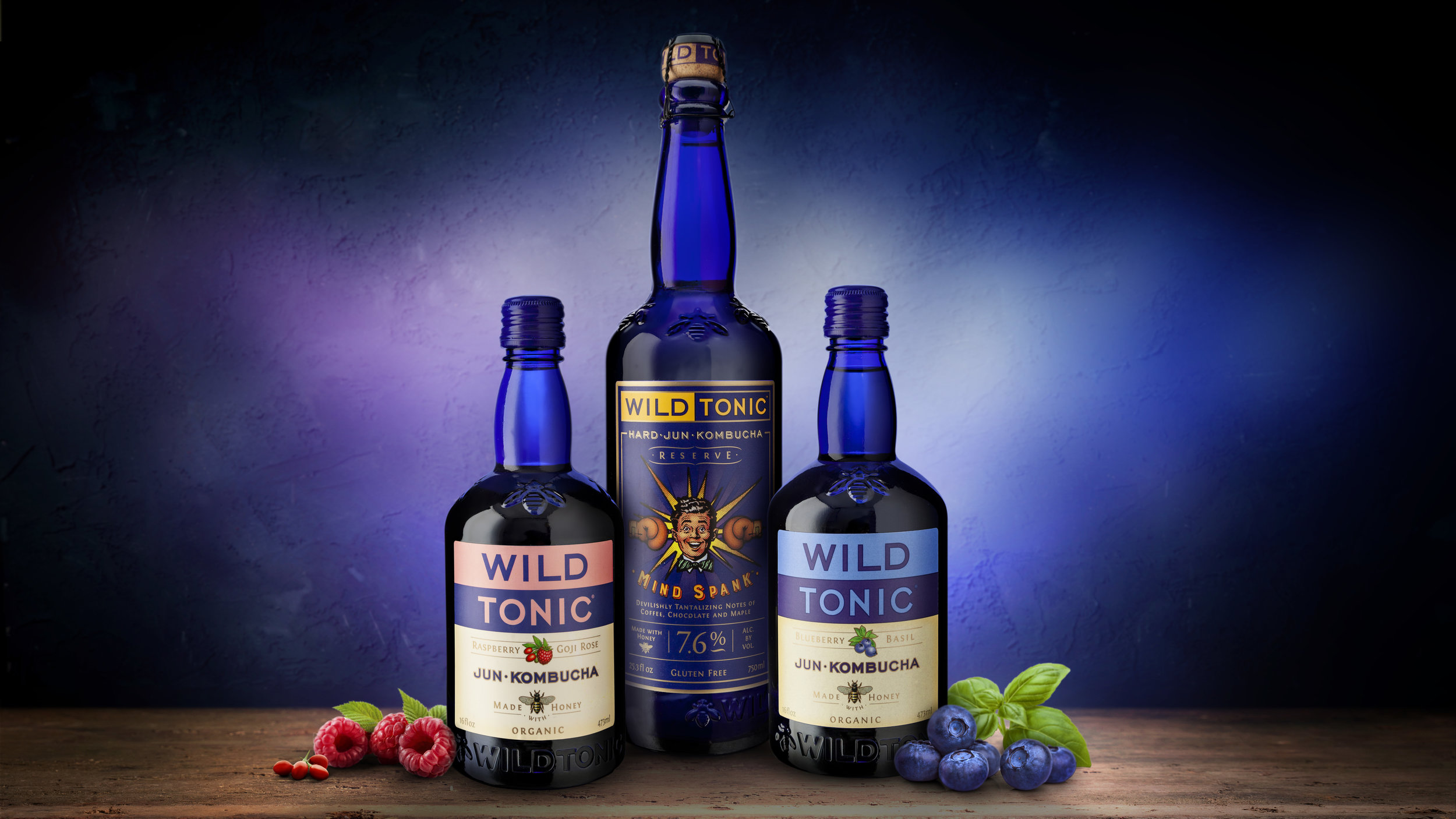
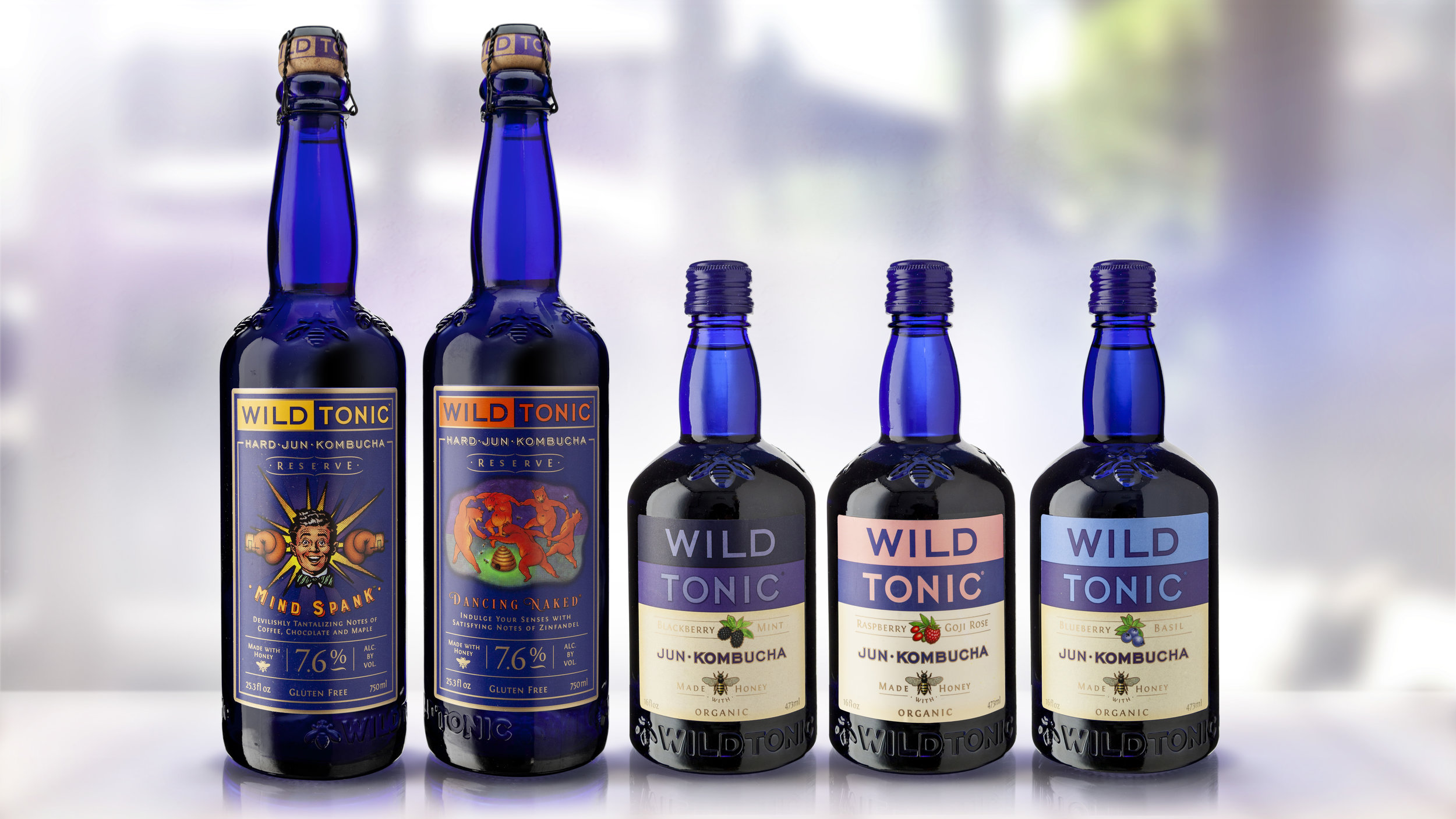
Through passion, determination and downright deliciousness, Wild Tonic became the wild child of the Kombucha market with their groundbreaking Jun-Kombucha drinks. We knew a bold bottle would be the ideal pairing for this bold brew to make it stand out from the rest and take grocery stores by storm. Studio One Eleven’s creatives and engineers designed cobalt-blue glass bottles that would protect the light-sensitive product while creating a small-batch feel with big impact. An embossed honey bee detail supports the apothecary-like silhouette with a nod to the authentic ingredient story. Our team then created a PET sister to the glass bottle to facilitate broader distribution of the single serve product. The results are beyond our wildest dreams.

![FidStreet_Hero_1_Sm[1].jpg](https://images.squarespace-cdn.com/content/v1/541e22dde4b0fcd826d4d5a1/1633360232675-LP6FWJ6PJXD08XFOSSRC/FidStreet_Hero_1_Sm%5B1%5D.jpg)
![MadAngler_Hero_1_Sm[3].jpg](https://images.squarespace-cdn.com/content/v1/541e22dde4b0fcd826d4d5a1/1629728407534-0XO8OA5STP5J48VRZCTJ/MadAngler_Hero_1_Sm%5B3%5D.jpg)